Indie game storeFree gamesFun gamesHorror games
Game developmentAssetsComics
SalesBundles
Jobs
Tags

HELP WITH TILESETS/ PIXEL ART IN GENERAL

A topic by Cipple created Dec 30, 2018 Views: 378 Replies: 2
Viewing posts 1 to 3

Hi guys! I am still a NEWBIE when it comes to pixel art! today was practicing a bit with pixel art style but... SHOULD SOMETHING LIKE THIS WORK for an ACTUAL GAME?

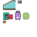
WHICH dimesions/ settings should I follow if I want to create USABLE ASSETS on future? sorry for my COMPLETE IGNORANCE!! and really ty for your help!!

The specific dimensions are a lot less important than just maintaining a consistent pixel size. As for what dimensions you want, it's going to depend on your art style. Some styles look sharp at an ultra-minimal scale, as small as a 5x5 tile. Sometimes you want detail, and you might want something that pushes 32x32 or larger.

I'd recommend drawing in a 16x16 grid size, it's the smallest possible size you can make stuff look actually GOOD and a lot of classic games were made with it :P Don't worry too much about restricting character sizes to 16x16, use the grid size as a recommendation. Having a base size makes it easier to make things fit together.


Some feedback on your art:

  • For a beginner, you're better than average! Don't get discouraged, you've got talent. Doesn't mean you don't need more practice though :P
  • Misty's outline style doesn't match the tiles. You should settle on either black outlines or no outlines, and use it consistently for everything. Having both just looks weird. Outlines makes things "pop out" more, so usually you'd have stronger oulines for characters than background tiles (since you want stuff like enemies and items to be easy to distinguish from background objects that don't do anything)
  • Having random irregular pixels makes things look more natural and less like perfect rectangles and circles. All real objects are subject to wear and tear and stop being perfectly shaped pretty easily. Almost all of your examples lack that, so they look kinda flat and unnatural as a result.
  • You're pillowshading, which means "have darker stuff around the entire outside of everything". This makes stuff look unnatural and not good.  Mostly the stairs suffer from this. Try to put the light shade in the top left corner, the dark stuff in the bottom and on the right, so the shading isn't symmetrical, and things will instantly look much better.