Indie game storeFree gamesFun gamesHorror games
Game developmentAssetsComics
SalesBundles
Jobs
Tags
(1 edit)

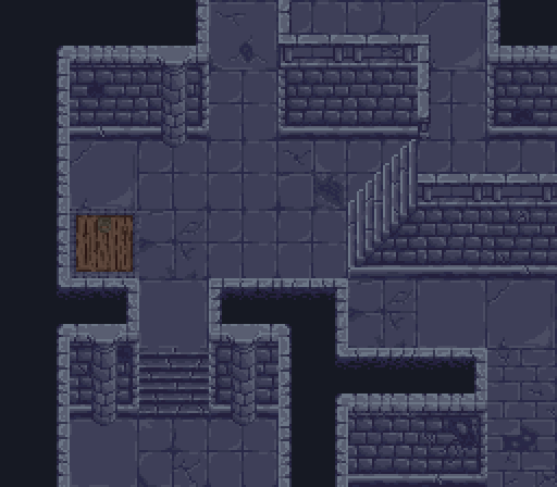
For a first post, this is rather nice.

As far as crit goes one thing stands out:

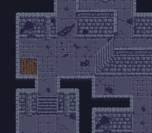
In this shot, the floor and walls have poor contrast. I can see where everything is, but it feels like it takes longer to parse the environment because of that. The tops of the walls and railings are a lot clearer than the rest of the wall, so it could help to adjust accordingly.

Yeah, that seems to be really bad...

Thanks a lot for your post. Will make it better as soon as possible :)

For the record, the shots with the wooden floors are much better in that regard! So I’m sure it’ll be fine once you adjust those.

(1 edit)

Yeah, another colour seems to give that :D

I've reworked entirely all the blocks (update will come soon for the tileset) and now it looks better. Would really like to hear your opinion, if you don't mind:

Big improvement imo, I think the problem’s solved in this version.