This is a reply using Google Translate. Please forgive me if you have any questions.
The art of this game is great, and it left a deep impression on me, as is the music. I like it very much, but in terms of play, there are mainly visual problems.
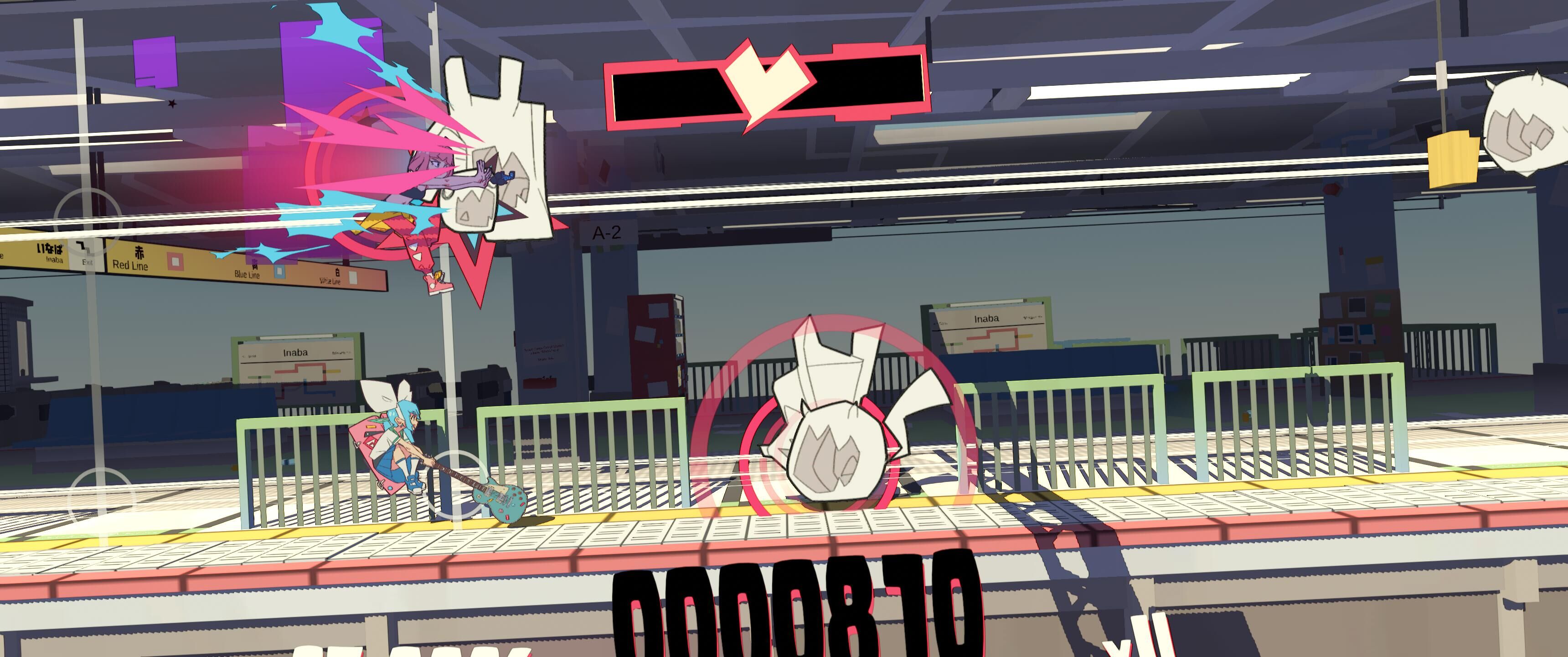
The background of the game does not have enough contrast with the notes, and the colors are also very close, which makes it difficult to see clearly when playing with a lot of notes, and it is easy to be visually fatigued; then the decision line can also be appropriately obvious, if allowed. Hope to be able to set the size of the notes.
In addition, I hope to add custom key settings, this is very important, thank you!


