Test 0.8 Beta2
For myself, I would leave the scaling at 175%. Don't look me like that, I bet it's the perfect option for the menu! Look, I even attached a photo.
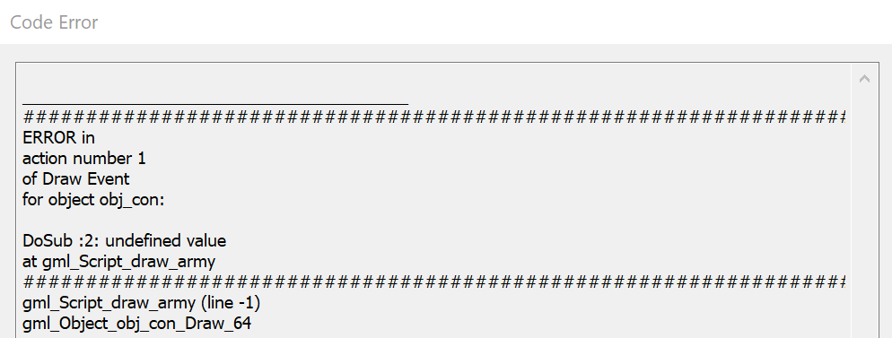
What problems:
- Pixel font, or anti-aliasing does not work. Maybe it's all due to the fact that it is too small or not correctly selected, I do not know.
- I would increase the font size for the New Game and Load Game buttons by 2-3 times (this is with 175% scaling). In this case, the buttons themselves should not be reduced! We need to play around with the size of the Options menu so that the buttons and menu don't overlap.
- Next, when you click a new game -> another problem, the map selection menu (when zooming). The fact that the menu for selecting a map has increased greatly is very good! But this way I cannot start the game (there is simply no start button!)
- The description of the units when hovering does not show what kind of Lvl they are, and the pumped units have some kind of rubbish instead of descriptions.
- The enemy's turn status bar is located just above the resource panel.
I suggest making 150% scaling the norm and adjusting the whole interface to it. In which case, +/- 25% in both directions (up to 125% or 175%) can be adjusted by the player himself, if he needs it.
The video is attached.