Indie game storeFree gamesFun gamesHorror games
Game developmentAssetsComics
SalesBundles
Jobs
Tags
A jam submission

Gradient GrovesView project page

A micro setting for Troika!
Submitted by Shamae — 21 days, 11 hours before the deadline
Add to collection

Play game

Gradient Groves's itch.io page

Leave a comment

Log in with itch.io to leave a comment.

Comments

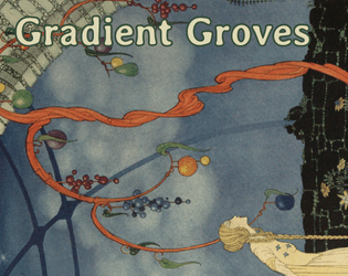
This is very well done. The layout is very clever, utilizing the drop-die point-crawl procedural generation simultaneously as an page index which is in turn is utilized for denizens, moods and menaces with enough variable options to have a few distinctively different groves. The cover immediately sets the mood.

Layout is also very well done, with font choices, bolding, tables and such making it clear to use.  Every inch of the page is utilized but is also organized clearly and without clutter. The only thing that I  would change is to make green in some headers darker/more visible, 

Developer

Thank you so much for the comment and the very encouraging breakdown!

You might very well be right about the green in the headers! I have to admit that I'm a layperson when it comes to readability and such. But I'm willing to learn.

If you wish more feedback, in Vivid, Hidden and Ancient Groves tabs, in upper left part of each page don't be afraid to use an occasional hyphen – more than one for a such short paragraph would probably be too much, but 'untouched' in Vivid Groves could have used a hyphen.

In 'Remarkable Trees', The Emptree, in line '...of serenity. Inside no' you might try to put 'no' on a lower line to create a shorter and less jagged line. When you use Align Left/Ragged Right text alignment you generally wish to avoid lines of noticeably different length and keep them as close to a block as you can. 

'1d3 sample ideas' lines look a bit redundant – in a such short and well-organized publication it is already clear what each 1d3 table is. Instead this line could have been used for something like 'Sojourned visitors to the grove', to add more mood. 

Developer (1 edit)

About hyphens, you're right. I have just started learning Publisher and I should probably read up on propoer text setting. I turned hyphens off, because I was afraid that it would automatically put a lot of hyphens on such small spaces.

In retrospect, on the 1d3 ideas... you're totally right! I overlooked that and could have got just a wee bit more flavour into the format... damn!

Thanks again for the advice!

(+1)

Turning auto-hyphens off is a good decision, but you can always manually use some and even if the text doesn't want to shift you can forcibly put the word on the next line with Shift Enter without creating a paragraph break, to manually adjust the line length.

Anyway, all this aside, it is still a very good work.

Submitted

The cover art is gorgeous!

Developer(+1)

Yeah, I was instantly inspired when I found it.

It made me come up with the idea to the Lady in Beige.

https://www.oldbookillustrations.com/illustrations/tree-marvellous-beauty/