
You have created such a wonderful and elegant game using the most basic components! This is a prime example of indie game design at its best!
I spent many many hours playing your demo and trying to maximize my score ;) I would recommend 2 UI improvements for you that would be easy to implement:
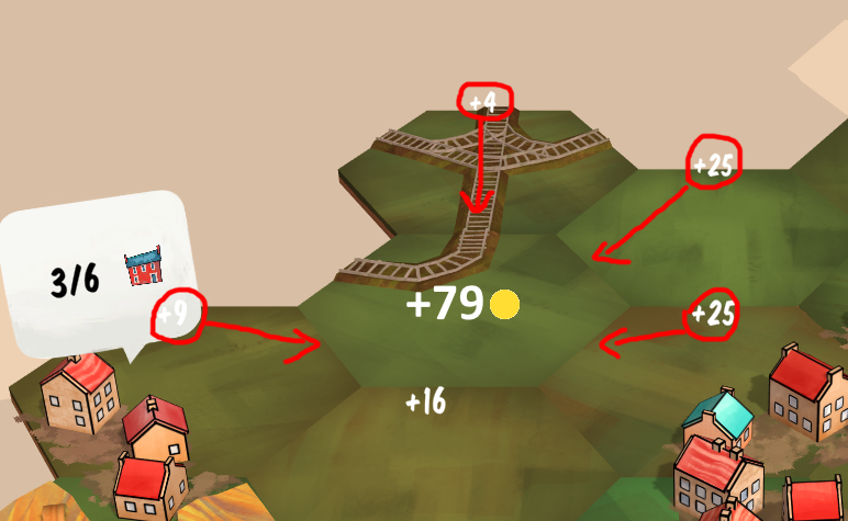
- Show the pre-calculated score before placing the next tile at the currently selected position. It is difficult to guess how many points we would get at a given position/rotation, so let's help the player with this calculation to determine the optimal position. The prospective score could be displayed in the middle of the tile like this (the red arrows just indicate that the partial sums can be moved closer to the tile borders):
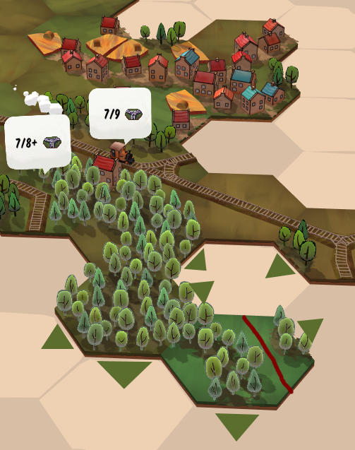
- Display "Continuation Markers" to clearly indicate in which direction a forest, village or farmland can be extended in the future. For railways and waterways, it is very clear that they can be extended only in a given direction, no surprises for those! But sometimes I accidentally closed a forest or a village formation, because I could not see if a tree or house touches the edge of a tile or not (which means no continuation). This is most important when placing a new tile. Furthermore, any "gaps" separating the trees or houses within a tile can also be misleading, so we should mark those gaps somehow. The following image uses simple green triangles as continuation markers for the forest, and I highlighted a gap in the big forest with a red line:
Of course, I understand that you are striving for a minimally intrusive UI and these extra indicators might look a bit weird. You can design them to properly blend with the game's overall aesthetic. Alternatively, you could make these UI elements optional, so the players can turn them on/off as they like!
I wish you the best of luck with this project!