Alright, well, I think some more updates are in order. Last one was...let's see AW CRAP A WEEK AGO
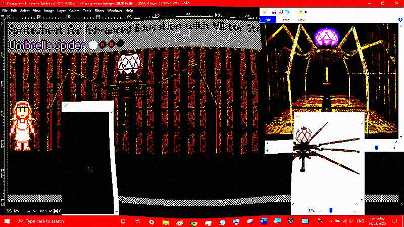
Alright, so, this is a bit of a mess. It might be a bit big but honestly I can't tell because I have no reliable measurement scheme since the screenshot was perspective and not orthogonal. That meant further legs were higher and really measuring the spring and body was...yeah.
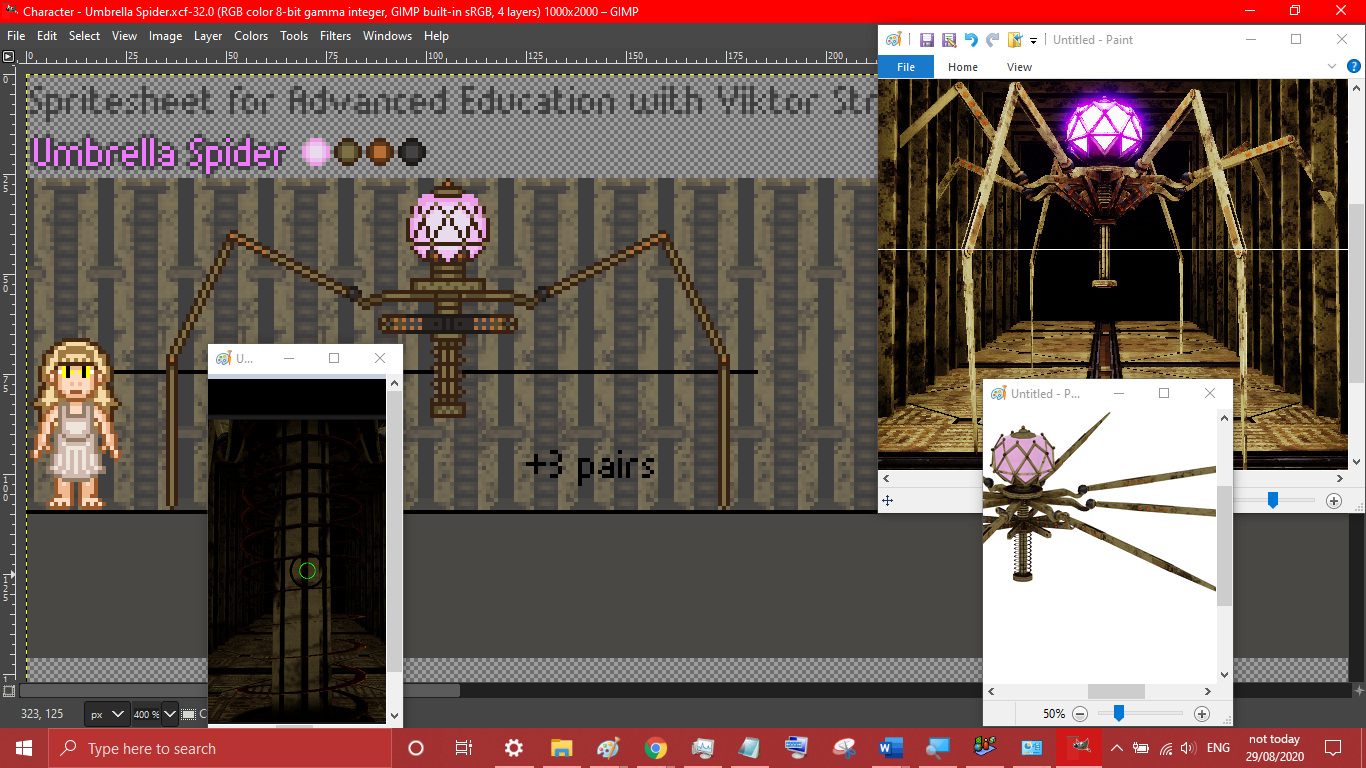
Two quick things to note already:
- It shared the colour palette with the Syringa.
Although, now that I look at it, it might have some extra colours I overlooked.
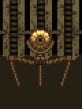
I will turn you into cheese...AND destroy the mice' hideout in this decaying building. AND release Oreichalkini Gata from captivity!
- Angell's dress looks a bit different.
Well, I managed to get what I was more going for and fixed some stuff. Now it doesn't feel as flat.
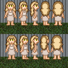
Yeap...I really don't think I have much to say, but it's probably better now.
So speaking of dresses, I kinda fixed Erie a little bit
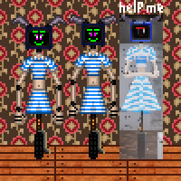
Eyes hurting yet? Cool. Still, that clipart tiling of cats on the new library wallpaper REALLY does not suit a horror game. And, you know...the old Erie was a lot better. She looked a lot more strict and bossy than the...attractive (and dare I say, a bit SERIOUSLY very much perverted) new model. (I mean come on, her dress is so flimsy and she's not collidable...very quick predicament right there...) Being a librarian also really doesn't suit her. It's like she was just forced to be a librarian, because, let's be honest - she hates Viktor and she really was. At least with the old design, she looked more the part. Anyway, here's the cleared up image.

Fixing her ears was a bit difficult, but I guess I did it. Now they finally don't look like...that.
You'll find that a LOT of sprite animators on YouTube kind of don't like the limitations of pixel art either. They use a lot of downscaled high resolution effects, ignorance of relative size, dynamic sizing, incorporation with much higher quality graphics, mixed sprite sizes, rotated sprites, sprites with subpixels, and a lot more. So staying true to the idea that we can have these images genuinely displayed on a small screen with large pixels is a bit hard, but I think it's worth it. But it gets worse. Because speaking of mechanical robots, I finally got around to doing Konstantin XI and let me tell you, doing the thing was rather infuriating. And although I was pretty calm, a lot of plans and details were demolished while doing this project.

It doesn't look actually all that bad - and in fact, the key aspect of the thing, the recognisability - was nailed, I would say. It's just a bit of a letdown. And also, if you look at it at lower resolutions, it's eyes will begin to indistinguishably merge with it's face in a dithered mess.
Remember the good old days, when the Language Level had a puppet, a priest and a pentagram? Sigh...what happened to those days...? I mean, now a nutcracker has to be enough to make people insane. I refuse to believe that. I think the Puppet's ugliness validated my insanity! And there's also a glitch now. Just, what is it and why is it? What's the point of it and why does it exist? Are we trying to give Baldi a free portal to Viktor's school? We need good reasons for that to happen first and my projects are not done.
With all my rambling, this is turning into a bit of a blog lol
(Still, it's much better than the ones the GTA fan makes, since it's actually sensible, relevant to AEWVS and contained in a single comment, possibly edited if necessary. This isn't a chat room, you know, just saying)
Now, speaking of robots, I also did the new Helpscreen.

No comment.
And speaking of robots, let's have a repeating loop.
But it gets even better, because speaking of cursed images, I want to show you what the Magnifier's automatic edge smoother does to the pixel art. Prepare to get your eyes rekt son, as soon as you open this image in another tab

But that actually doesn't look too bad. YOU KNOW WHAT WILL THOUGH???
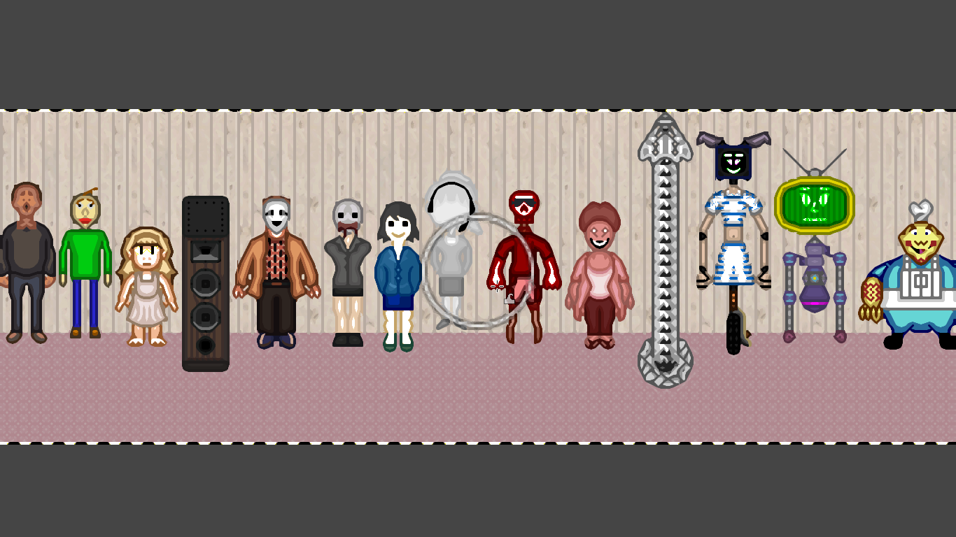
don't do it boy
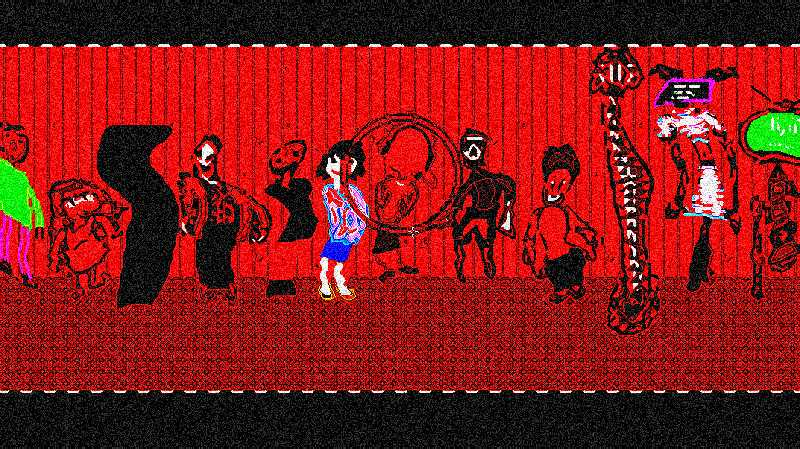
DON'T
your dreams will be haunted forever


