

Hey, nicely done! You mentioned you made all the assets yourself, does that include the banging background track? You've nailed the vibes for this. And, yeah, it's hard - but I think you've straddled the line between totally inaccessible and tantalisingly difficult quite superbly well!
I like your use of intuitive design here. Green for safe stuff and red for danger means you have basically zero effort learning the game. I thought maybe if you made the player character a different colour, it could help lead the eye to danger more easily.
Like take a look at your thumbnail squished down to squinty size.
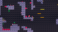
Does your eye know where the player is, where the dangers are, and where you're supposed to be going? I think in some levels you really nailed the visual flow, especially in the first level when the brown kind of points you up like arrows. But yeah, giving some more thought to what the colours specifically tell you about where to go might be an avenue for future exploration.
But I dunno, that's just if I dig really hard for feedback. Overall this is one hell of a submission! How much time did you spend on it? Also you said you're really proud about it but I'm curious what was novel for you, in designing this game. Did you encounter any design challenges you haven't dealt with yet? Or expand on any skills you thought were good to practice?
Anyway, really nicely done! And thanks for submitting!