Put up my first video devlog this morning. Three months of a creature card battler that started as handwritten index cards in penny sleeves on my desk, through a tabletop sim so people who were not in the room could play it, then a C++ rules engine that plays the game against itself, then the browser build, then the first commissioned paintings.
It is about four minutes. Making it was its own strange milestone, and also a moment to quietly cry that i've sold a part of my soul to be a blogger to try and market this project.
The reason I am posting it here rather than just leaving it on my page is that making it forced me to look at three months of card faces in a row, and I came out of that with a problem I still have not solved. It is barely in the video because I only really understood it while cutting.
Something happened on the way to the rendered version that haunts me a bit, just because the _v1 of the cards were handwritten. Name at the top, the die and its rows down the middle, whatever the card did underneath. No layout, no grid, no flavor, just my handwriting and however much room was left.
The rendered face is better in every way I can measure and slightly worse at its actual job, which is being read from across a table (from a screen) without clicking on it.
Two things I think I lost.
- The die rows used to be one column of handwriting, so your eye ran down it in one pass. On the rendered face every row sits in its own little box. Tidier. Slower. The box edges give your eye somewhere to stop, and it stops at all of them. I built a grid and then had to look at every cell in it.
- The other one is worse because I did it to myself. Handwriting had no room for a paragraph, so an effect had to fit in about six words. The rendered version has room. So the effects got longer, and the flavor i was so excited to add in made it too. I don't think they got any clearer, just busier.
The part that actually stings is how I found out. I printed the current roster to test a balance change, sat down with the paper copies, and read my own cards faster on paper than I read them on the screen I spent weeks on - oof...
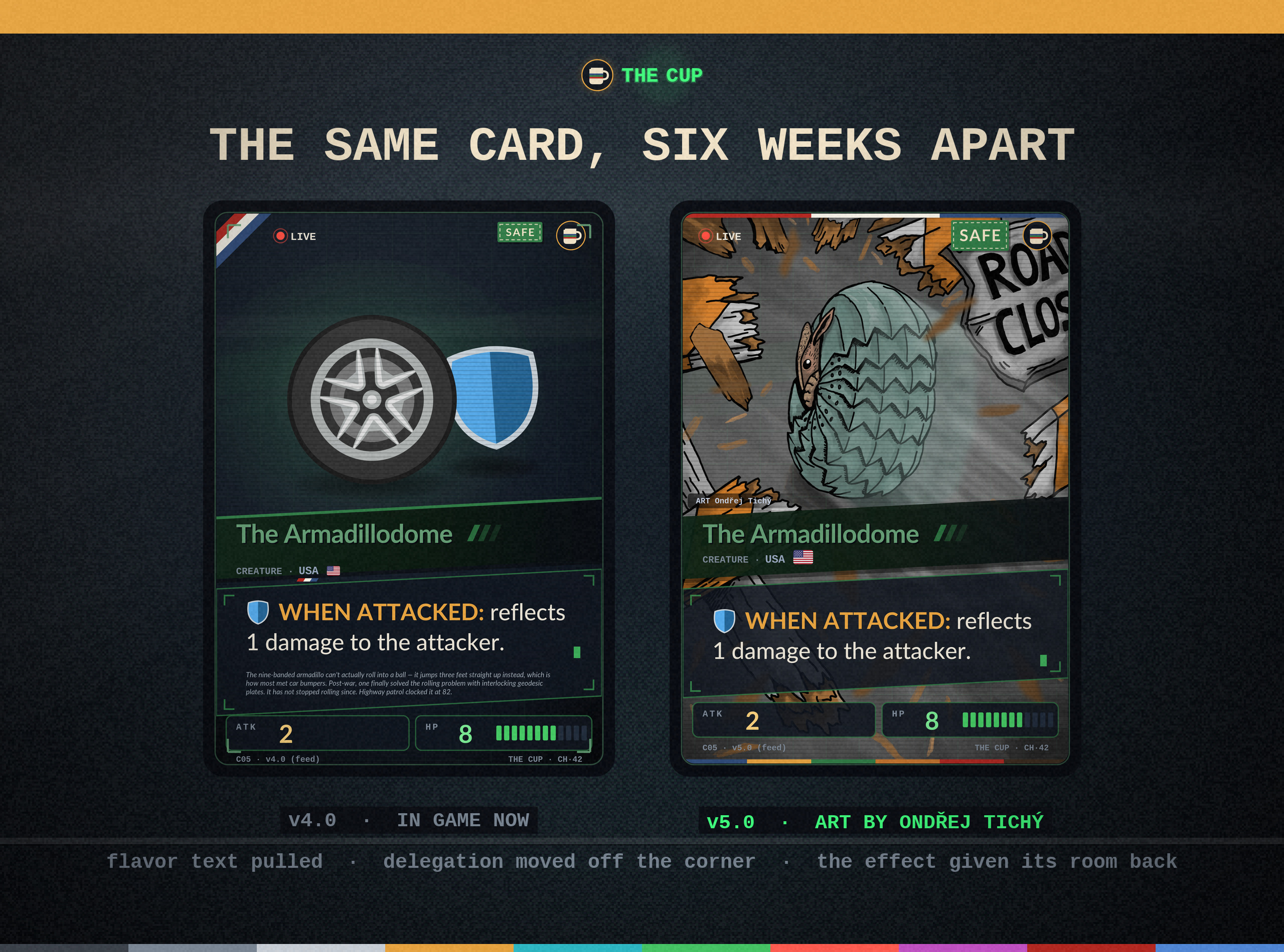
So I have started pulling things back out. Flavor text is off the face for now, which hurt after how pleased I was to finally have room for it, and I am redoing how the card shows which delegation a creature belongs to. Both are out with a few friends for feedback and I do not know yet if either is right. That is probably the next video.
The layout itself I haven't fixed completely. Next pass is going to put one column against boxed rows in front of actual people at actual table distance, instead of me at 200 percent zoom deciding it looks fine.
So the thing I actually came here to ask: do boxes around numeric rows help at table distance, or is a box only ever helping the person who laid it out? I have gone back and forth on this for weeks and I have never been sure either way.
And if anyone has a card game whose cards you could read across the table without picking one up, I would love to know what it is so I can go look at it!
Here's a preview of the changes i've made so far featuring the next completed card art: