

Review time~
Creativity
In this Episode of Advanced Chef! A gamejam about counting down, a stead cleaved from the bone! A man that kind of reminds me of Guy Fieri and Gordon Ramsay had a love child.
Enjoyment
This feels like a small scale, single player version of Overcooked. It nails the fast paced feeling of "Oh NO I threw the steak into the plate before its done!!" I enjoyed how the levels themselves slowly introduced the mechanics over time, good design instinct. When I saw the mixer I responded with "oh no."
Controls were alright, jumping felt a little awkward on the fish and chips level, but it wasn't too bad. There's a bit of clearance space that makes it feel like you're bumping your head a little in some levels.
Narrative
Strong narrative. You don't always need to have cutscenes or voice acting, the idea of being a chef is clearly communicated and follows through, with each level communicating what activity/food you are prepping.
Artwork
Artwork is good. The characters, food, actions, and location are both clear an readable.
I recommend in future projects pinning your texture sizes to 16x16, 32x32 or 64x64 and quartering them if you need them bigger from there (This results in a game that looks like this). This ensures that same pixel size and density is kept across the pixel art style. Alternatively you could try using a pixelization shader and run that as a post processing effect (which results in a game looking like this instead).
Audio
Music is theme appropriate and overall fits the vibe, sound effects are used appropriately. I would recomend that if you use 8 bit - 16 bit SFX to run a .1f +/- pitch in unity on play. This will give you audio variance without needing a lot of audio files.
Technical / UX / UI Observations
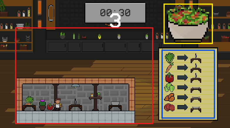
The use of space it something I wanted to comment on.
Red: There is a lot of negative space, especially in the early levels which feel a little awkward. In general, player's gaze naturally drifts from top left to bottom right, so placing the main level bottom left leaves a bit of dead space which is highlighted by the visual space a player's eyes need to cross.
Yellow: The food we're making is a non essential UI element. It is a nice touch but does not to be present taking up that much screen space.
Blue: This is viral information which is conveyed in a large block of information. This could be broken up into three smaller sticky notes. This would also give you up more space to work with. Similarly other levels struggle with information overload when it comes to communicating the steps the process takes.
Concluding thoughts
A solid entry made by a good team. I enjoyed my time and got all the way to the end of the game feeling like I wish it were twice as long but not feeling disappointed at it's length.
