

Review time~
Creativity
The game sticks to the theme of the jam pretty well. The use of mixed perspective assets gives the game a unique feel.
Enjoyment
The game was overall enjoyable primarily due to the cute art and narrative. The movement felt pretty good and responsive with ledge grabbing being a particularly nice touch. However, the games difficulty in platforming ramps up to an unreasonable degree. I was able to finish the game by using skips, but I was not too happy for the game to call me out on it, creating some dissonance. Combat felt a little clunky at first as I was attacking on 1 and did not realize that there was a sound effect/go section; were I to design a tutorial I would maybe have the first attack of combat auto play to show the player before going into regular combat. I would also recommend a different sound effect for Perfect, Good, and Miss as the feedback on hitting and being hit was weak.
Narrative
The narrative is present, clear enough to understand and follow. The progression of lackeys makes thematic sense for a witch. The background environment makes sense for a knight and so does the combat.
Artwork
The character designs were adorable and the little animations were really solid. The mixed perspective of 3D and 2D make the game stand out. I would like to see it fully detailed. The hazards are clear and readable as I knew that touching them would likely be bad before having to touch them. One bit of advice I would recommend is to swap out the default text in combat with another font and provide the two options "Attack" and "Heal" a frame or button to distinguish them from the rest of the text.
Audio
Sound was overall well utilized but there is no way to mute and or adjust audio.
Technical / UX / UI Observations
- Audio que for buttons in main menu is short punchy and good.
- Title appears to be a bit crunched, recommendation of using either a vector graphic in future or TextMeshPro
- Buttons in main menu have their text aligned to top, with Play and Exit aligning but Credits appears to be lower down.
- Credits has a good colour pallette between yellow, black and white, makes it pop.
- Main menu lacks a little bit of animation, buttons move, but when no player interaction is made there is no change.
- No way to skip cutscenes.
- I have mixed feelings on "Skill Issue" being as response to a accessibility option.
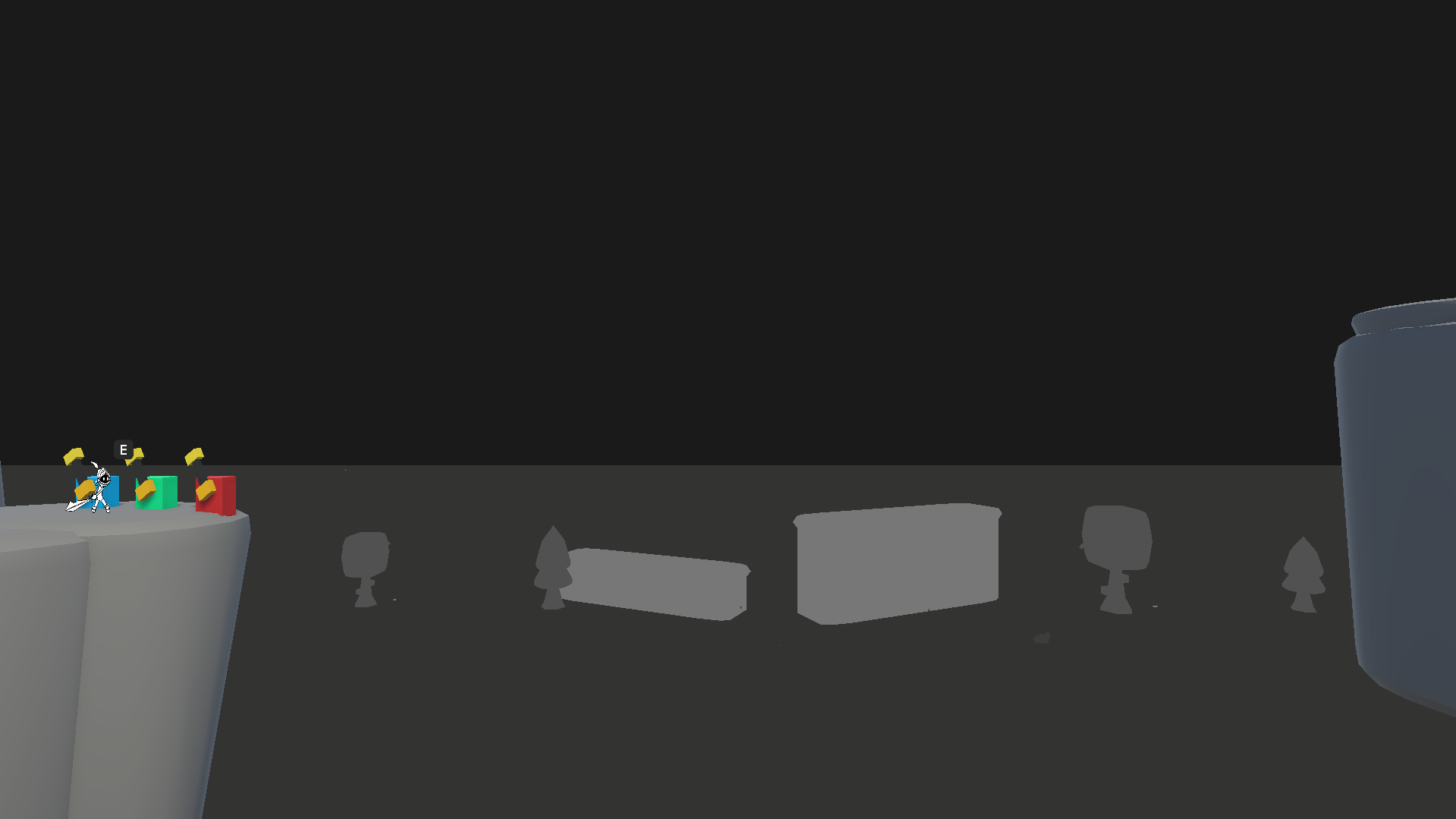
- Be cautious about including platforming sections in games in which only one to two players have play tested on the game dev team. By default, a game dev is the best player of the game on release. Having to contend both with timing and distance and having to reach both the top of hill is too much of a difficulty spike.
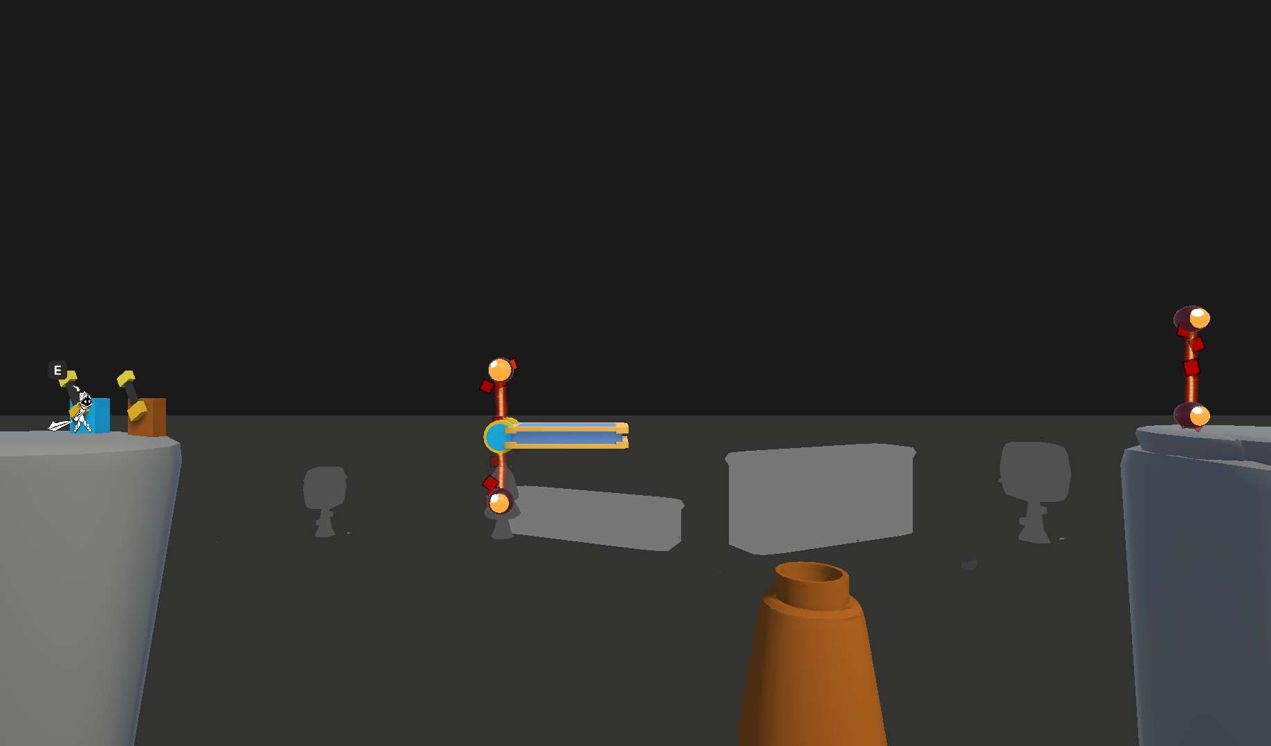
- This level is very close to being excellent. The hit boxes of the instant death lines however somewhat ruin it. I would recommend lowering the lines by 10% of what they are as I kept getting clipped on them long after having realized what the timing should be with everything.
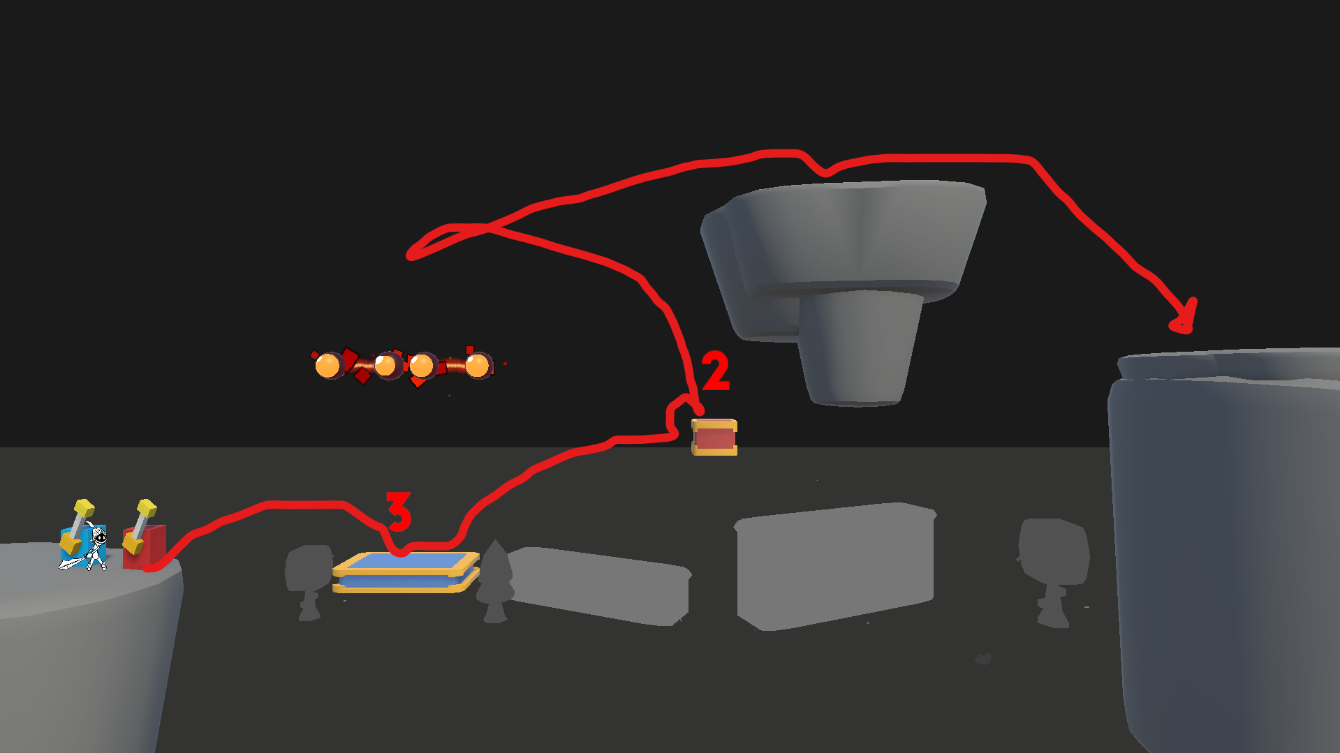
- I get the intention behind this level, the set up in nice, but the spacing of it is once again a little too stretched out. Leading to timing that's only comfortable to those with a lot of experience with this game specifically.
- There is no way to quit or pause the game from within a level without having to tab out.
Concluding thoughts
First of all, great job on completing a game! Despite my thorough review I did enjoy myself. I would be interested in seeing a fully polished up version of the game. The design flaws of the level design are easy enough to fix as they just need to dial back the difficulty.