Accessibility Development: LOW VISION/High Contrast Mode
Just as some background, in my day job I work with blind and visually impaired people. So when I started making my own game, I was always intending to do my best to make it accessible to people with different levels of vision. First step has been a high contrast mode.
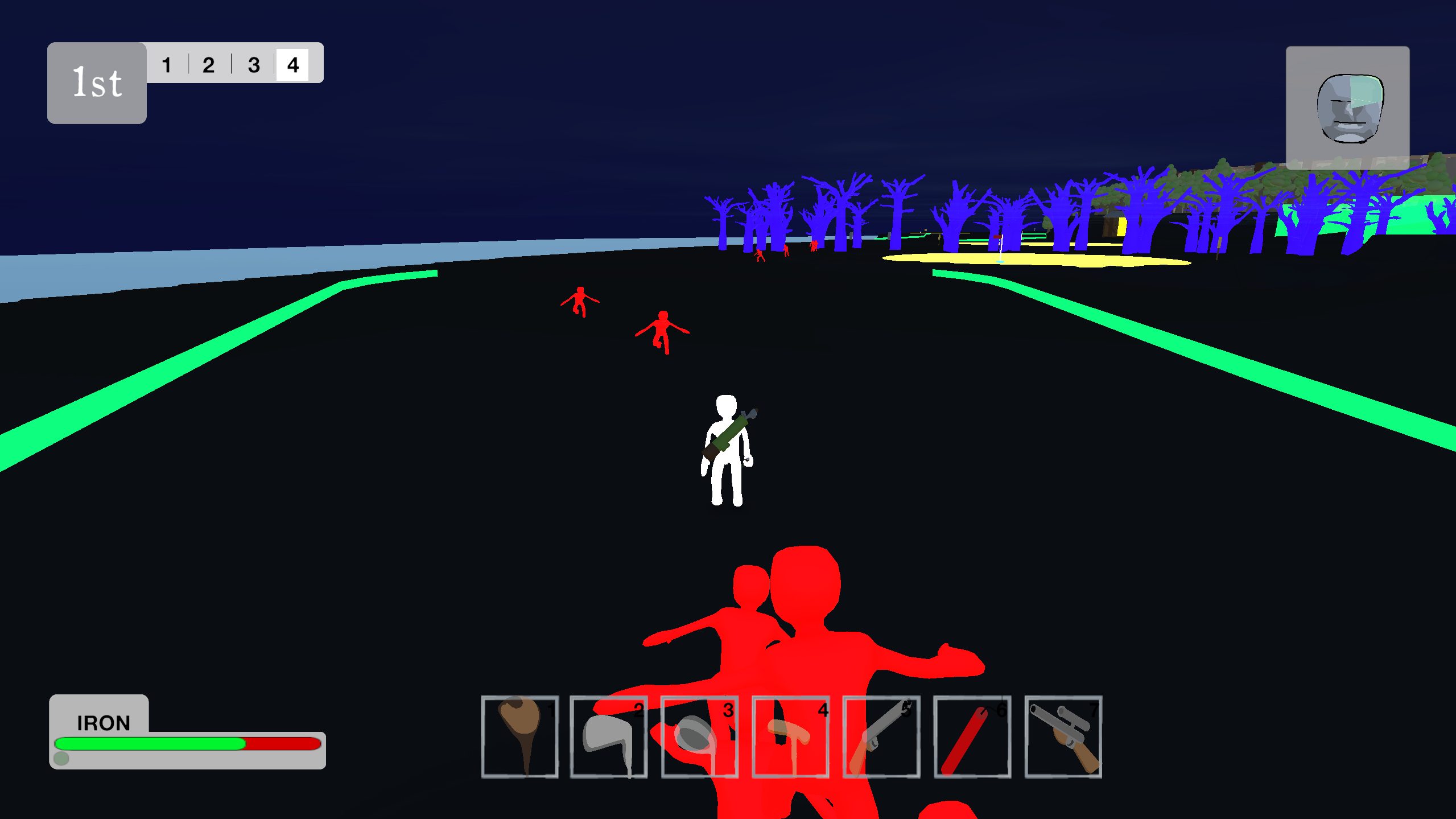
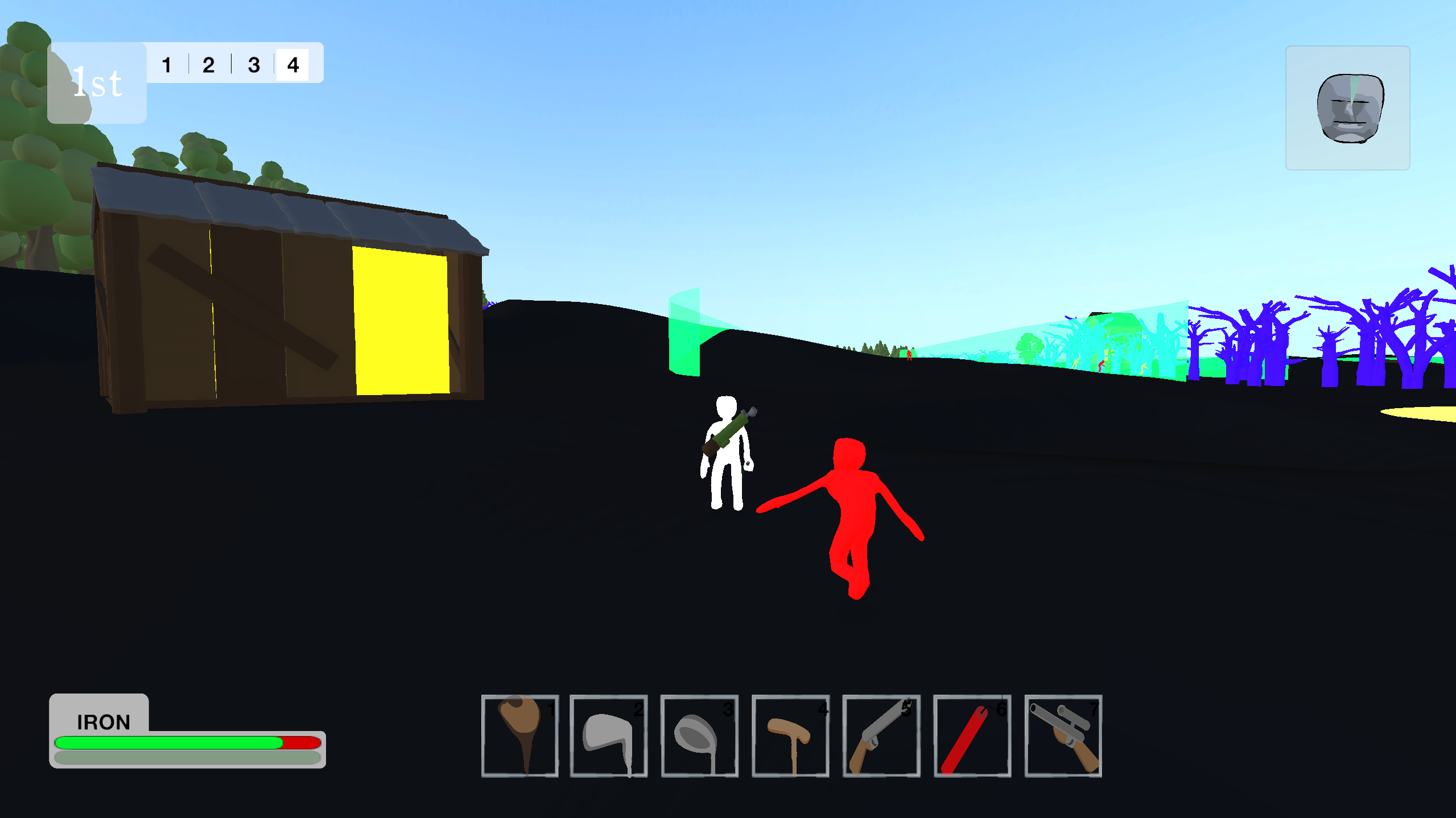
It works really simply. When the game starts, it checks for all the 3D objects with certain tags. At the moment, these tags are Player (obviously), Enemy, Obstacle, Goal and Guide. Then it changes the materials of those objects to high contrast materials with an emission. It also sets the terrain to black.
All the high contrast guides I saw recommended Shaders, but they still scare me a bit. This was easy enough to code, and it doesn't seem to have any major issues in terms of optimisation. It also lets me do some pretty funky things. For example: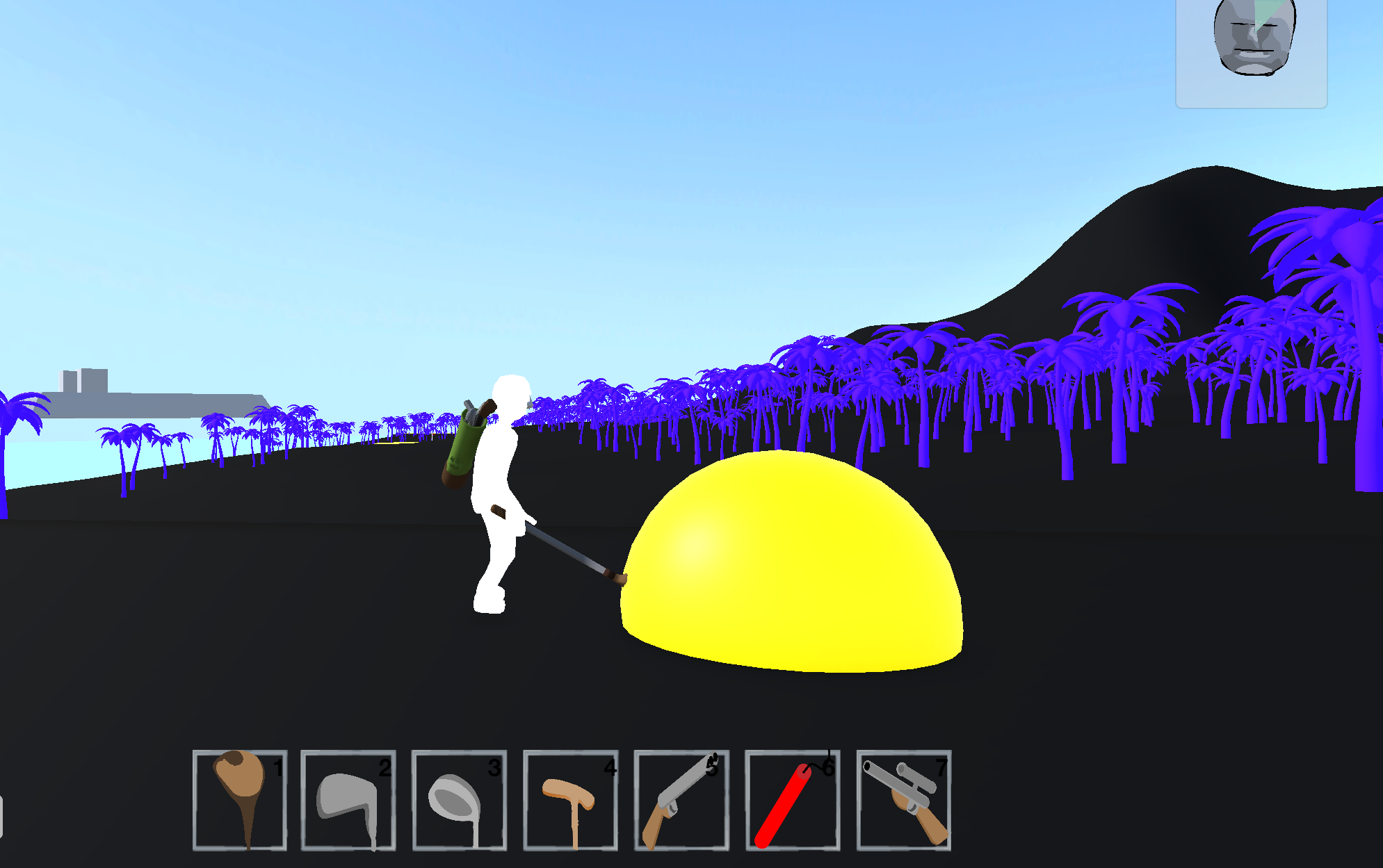
The ball has a large easy to see orb around it, helping the player spot the ball at a long distance. This orb exists even when the high contrast mode is off, it just has a transparent material normally.
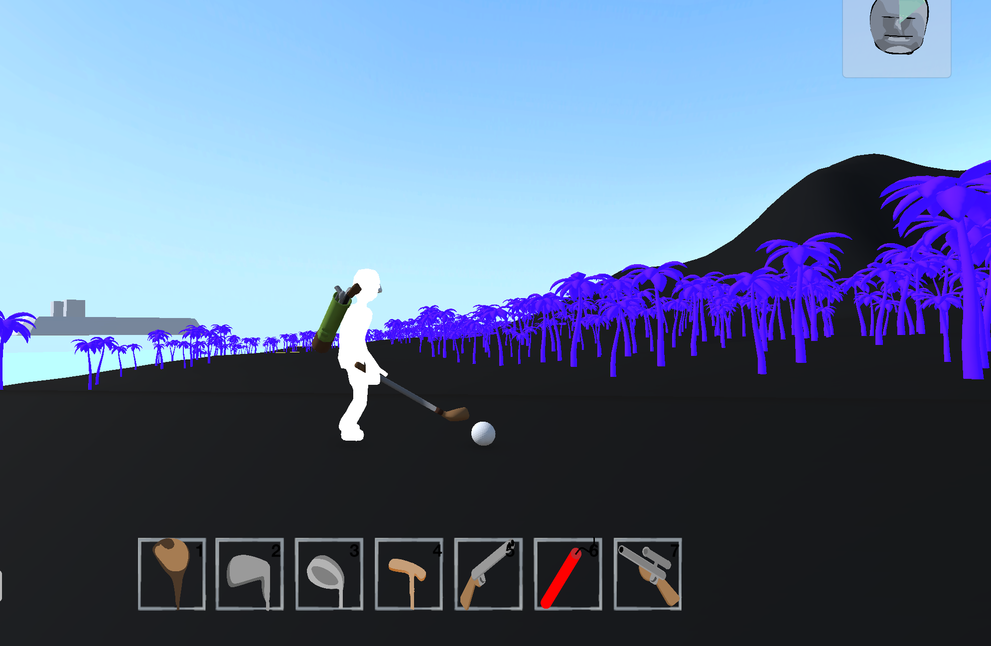
When the player stands closer, the orb disappears to show the ball. This is just a simple collider setup which turns off the model when the player comes near. I have done something similar with the greens: 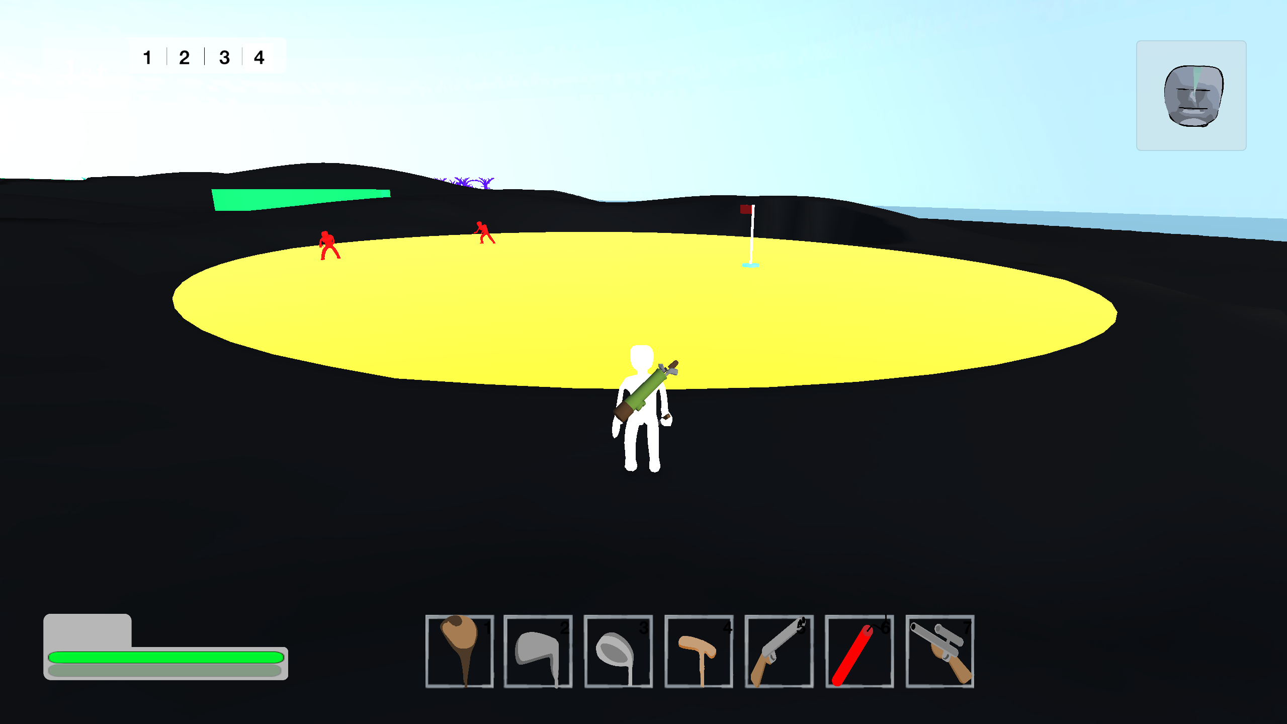
When the player or the ball isn't on the green, it will show up in yellow. But if the player or the ball touches the green, it disappears.
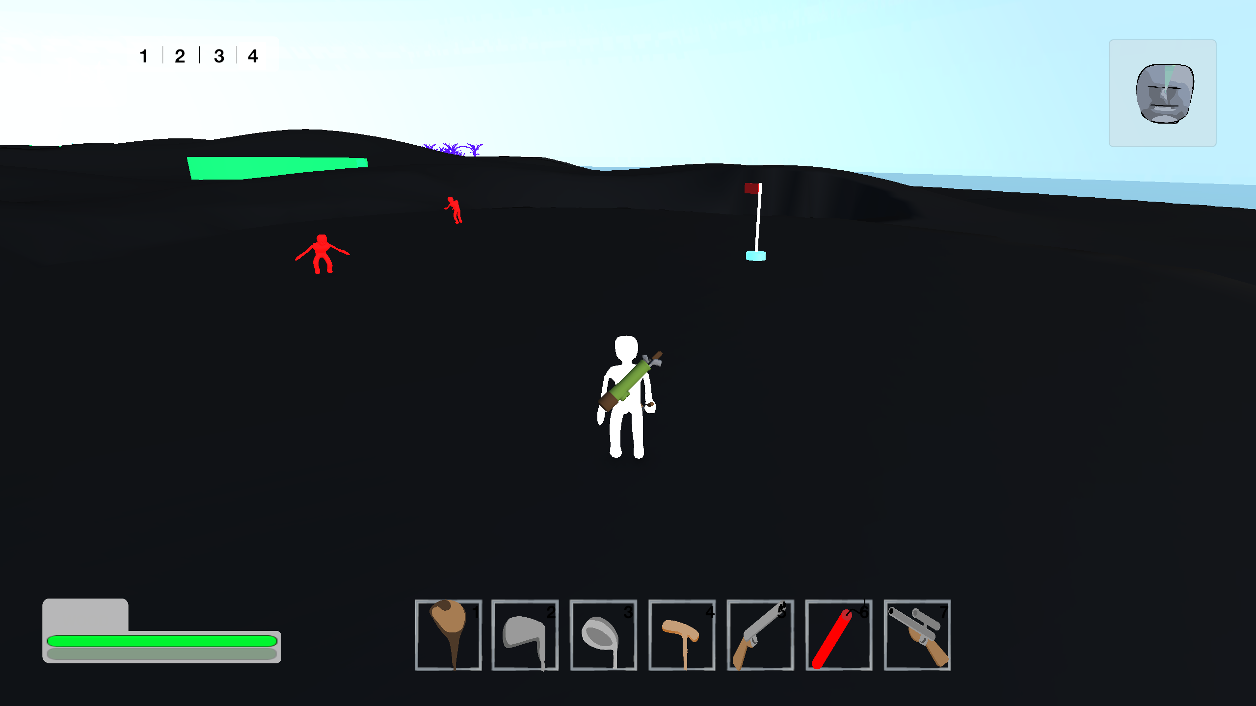
I may make it so that an outline shows, I'm not 100% sure yet.
The other feature I can add by using this material based solution is guide lines. I've set these to green, and are translucent. These indicate where the fairway is. The taller they are, the more gradient the fairway has. So low guide lines = flat fairway. High guide lines = hilly fairway.
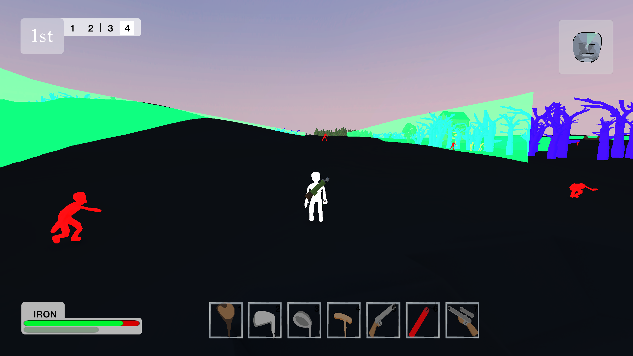
I'm really happy with how this accessibility feature is shaping up. I really want it to feel like some effort has gone into it, and it hasn't just been chucked on afterwards as an afterthought.
Oh, and I also really loving this vaporwave night-time aesthetic!