

The UI looks nice but i don't really like how the tooltip follows me around when i hover over a character. maybe just make the window pop up above the characters so theres no obstructions at all. it might seem like a small thing but it gets annoying quick.
This is just my take but i'm really not a fan of games with monstrous amounts of stuff going on in or with the UI, it makes my eyes dart back and forth. so naturally... i just looked for a way out of the menu and for a way into the game itself.
Now, i know that this is meant to be a demo but i do feel UI elements need to have some hierachical order but right after pressing the Dungeon button i got hit by the three different dungeons, i'm here looking at the three dungeons and thinking,
"eh, what do the different buttons on each dungeon have to do with the dungeons itself".
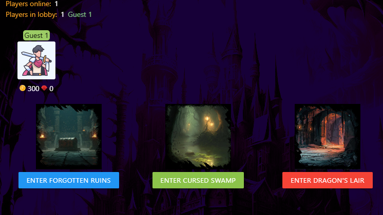
Looking closely, i realized its just like the theme for each room? I don't think changing button colors is a good design choice it makes it look kinda random, don't you think so? you can probably just turn the awesome level images into the button itself.
Playing the game
The tooltip type windows are everywhere now,
i can't hover in peace any more. moving through the UI feels like the actual battle than the battle itself, and apart from that, i honestly dont know what i'm doing or supposed to do... is this an auto battler?
This game will really benefit a lot from a very good, detailed tutorial cause again, i had no idea what was going on
'_'
There also needs to be a way for us, your players to know what rooms we are currently in...
the game's pretty UI heavy but feels very bland with a lot happening not much happening all at once.
but hey, this isn't my kind of game and i'm definitely not your target audience so my feedback based on gameplay won't really matter all that much.
Best of luck though, i'd like to see a more polished version of this soon... especially in terms with the UI.
Please let me know if you'd like to hang out some more.