
This isn't as blinding as some light theme IFs ive encountered (thank you for the slight beige paper-tone in the background) but I will still petition for a dark mode. I get eye strain really easily with light backgrounds and while I can manage it, a dark mode would be very nice if its possible.
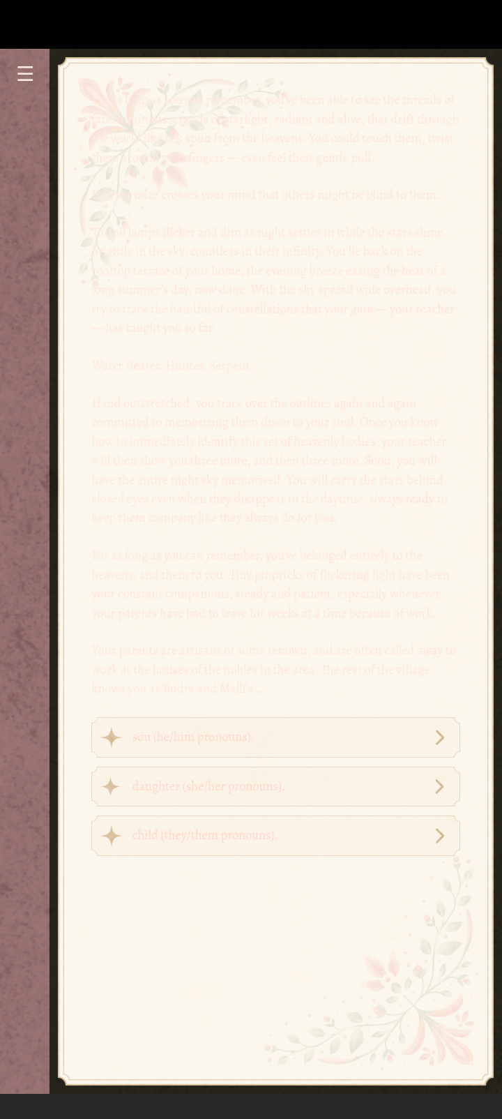 It's also very difficult to read;on my phone the text is almost the same color as the background. That screenshot is what I see on Android.
That is really strange, this is what it’s meant to look like. Just making sure, do you have any accessibility features on which modify colours on the screen? Or would this be of any help?
First of all, I feel so bad because I thought I’d replied to this. My apologies 🙇♀️
Unfortunately this seems like a localised issue. I'm thinking that something is forcing it to invert contrast but it is somehow only working for the text and the collapsed sidebar. Looking into it, there could be a few things happening:
1) Applying dark mode, either for phone or browser. Check your system settings (probably under Settings > Display) and see if system-wide Dark Theme is active and try toggling it off if it is. If you browser has a dark mode, try and change that to Light mode.
2) Ensure that high contrast text is toggled to off, probably under Accessibility settings.
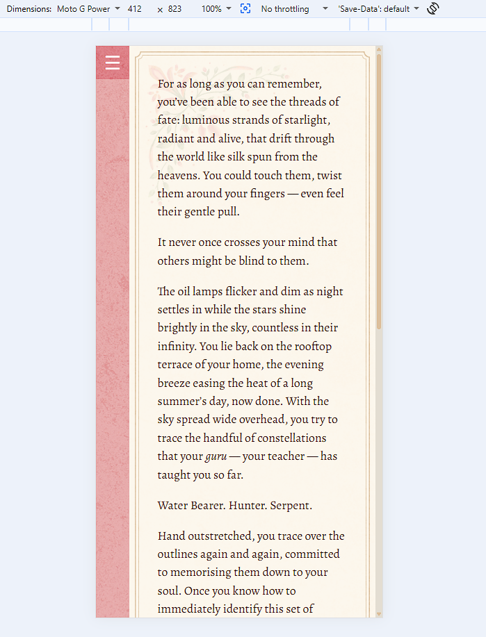
You can also check to see if it looks the same in another browser whether to isolate if it's a browser-based issue or a phone-based issue. Our browser lets us test the Twine file on different devices' displays. I have Moto G Power available, which I'm using here and it looks like this:
Terribly sorry about the inconvenience! Our UI artist is working on a dark mode, so perhaps once that is launched it'll be more compatible.