

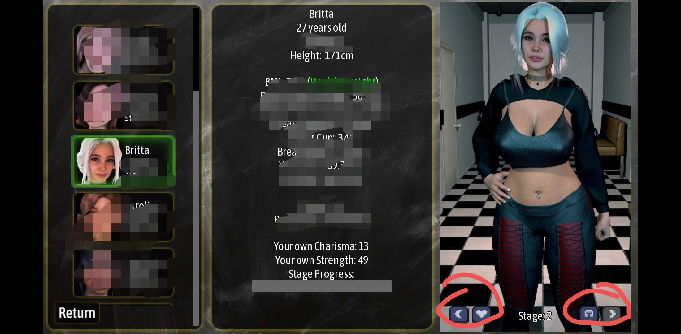
For the character stats screen, I would suggest making the left column hide names like one of those drawer pull menus often seen on mobile apps. Idk if that’s easy to do in Ren’Py. Otherwise it might look a bit weird with how much stuff is on that screen with larger buttons. You could also try splitting that screen into multiple menus, or just rearranging the buttons.
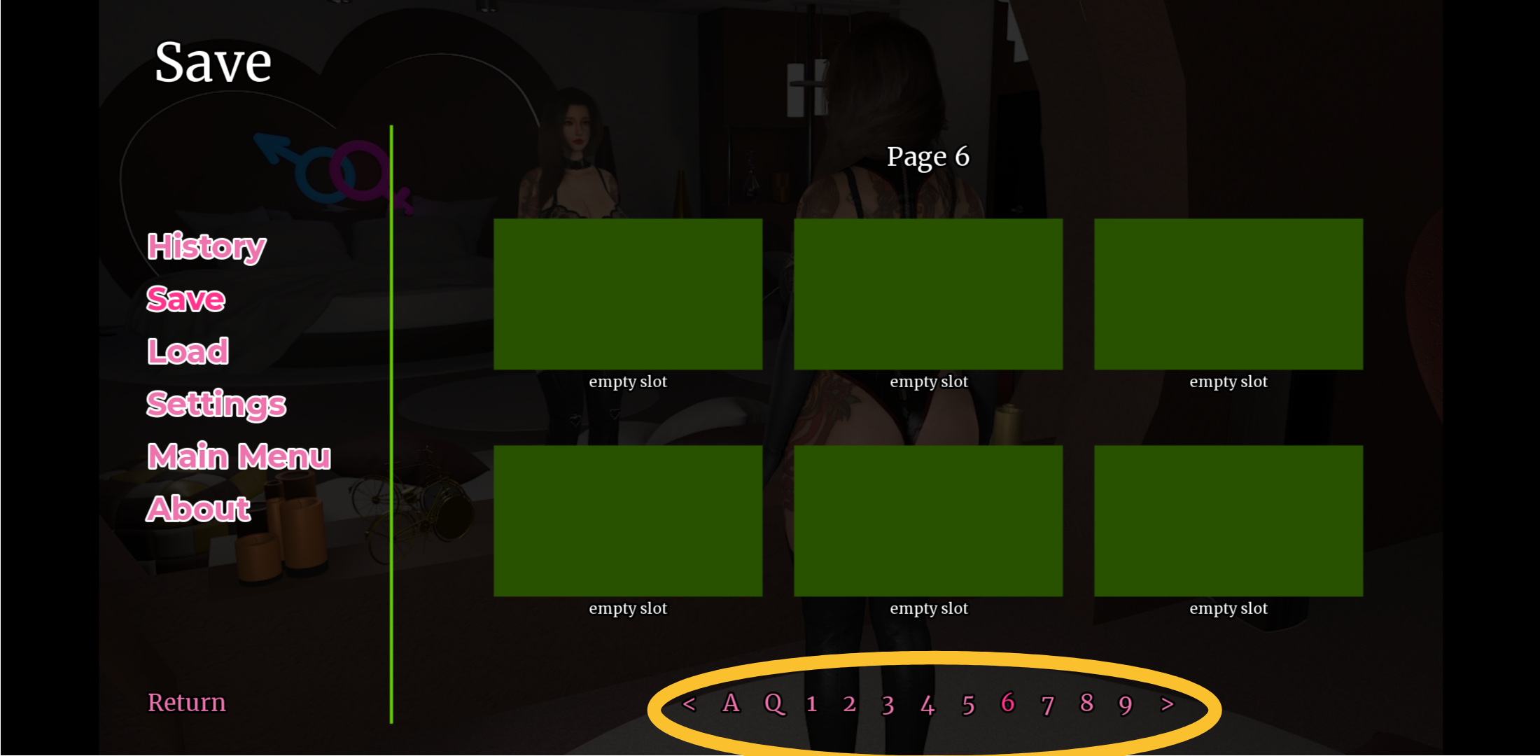
On the save screen, if you just scale up the “page” buttons to be the same width as the slot screenshots, I think that would be the perfect size. Like the < is lined up with the left edge and the > is lined up with the right edge.
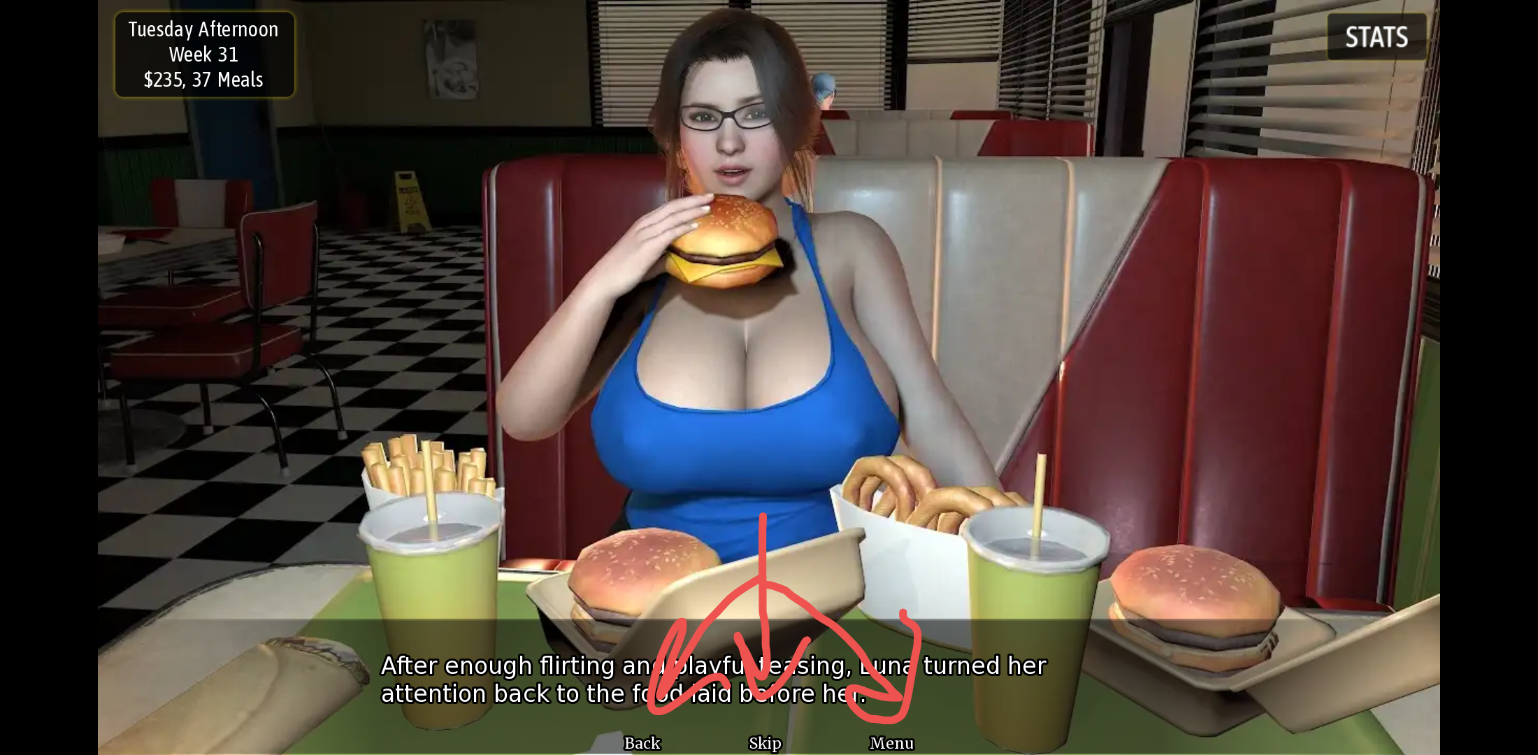
The button sizes are perfectly fine for desktop, but unless you play on a tablet they’re way too small for mobile. You should keep in mind people are using their thumbs to hit a small part of their screen. If your button is smaller than a single letter on the phone keyboard, it’s nearly impossible to press!