

Hey RemiQA! I have a browser-based 3D chess variant called Aurora Chess that might be interesting to test it runs fully in the browser on itch.io so it fits your requirements. Would you be up for it? Link: https://hasa92.itch.io/aurora-chess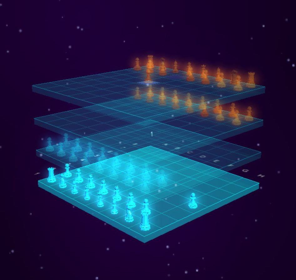
Viewing post in I will test your game, for free(PAUSED)
Hey,
Overall, the game looks really nice visually, the aesthetic is great. Here's my feedback:
UX & Flow. The tutorial prompt (asking whether to play the tutorial or skip to the game) currently appears a second after the game loads, which causes a jarring visual effect. It should appear immediately when the player clicks Play instead.
The configuration/setup screen is too long. Players have a very short attention span at this stage, they just want to start playing. Consider trimming it down or simplifying the flow.
UI & Readability. The default UI size feels too small. On a 27" 1440p monitor, I had to increase the font size to 130% to be comfortable.
The toggle buttons in the configuration/options menu during setup are not clearly visible, only the coloured circle is visible, with no visible background behind it.
In several places, text is very hard to read. Specific examples:
Play vs Computer AI: Configure screen (step 3 of 3). The text below the time control is barely visible. Inside Pass & Play label is similarly hard to read. Opponent colours are difficult to distinguish at times, it's not always clear which piece is white and which is black. I'd suggest making these more visually distinct. Or changing the enemy colour altogether.
Controls & Camera. I'd suggest reassigning the mouse wheel to zoom in/out rather than switching between board layers. The number keys (1, 2, 3, 4) are sufficient for swapping layers and feel more intuitive for that purpose.
The key combination Shift + "-" to zoom out is inconvenient, particularly when on a higher layer (e.g., layer 4) where you need to zoom out immediately to see the board properly.
The available zoom range feels excessive in both directions, as there's no practical reason to zoom in or out that far. I'd recommend tightening the zoom limits.
This is clearly a niche game, and I'll be honest that it's not really my type, so I may not be the best person to give deep gameplay feedback. That said, I hope these observations are useful. 🙂
The visual foundation is strong, and with some polish on the UX and readability side, I think it could feel much more welcoming to new players.
Best regards,
Remi