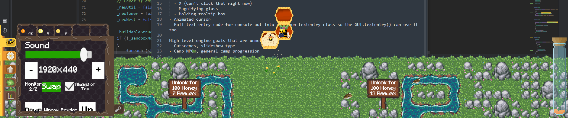
I've loaded it up again, the monitor swap feature is appreciated!
Overscrutinizing it in paint.net, the sprite scaling is pretty good.
Text has blurry edges which drags everything down, but aside from that I'm only seeing some minor scaling mismatches and misalignments that probably aren't obvious unless you're zoomed way in on a screenshot like I am. The settings menu sliders and checkboxes are not pixels at all so I'm assuming that's just unfinished.
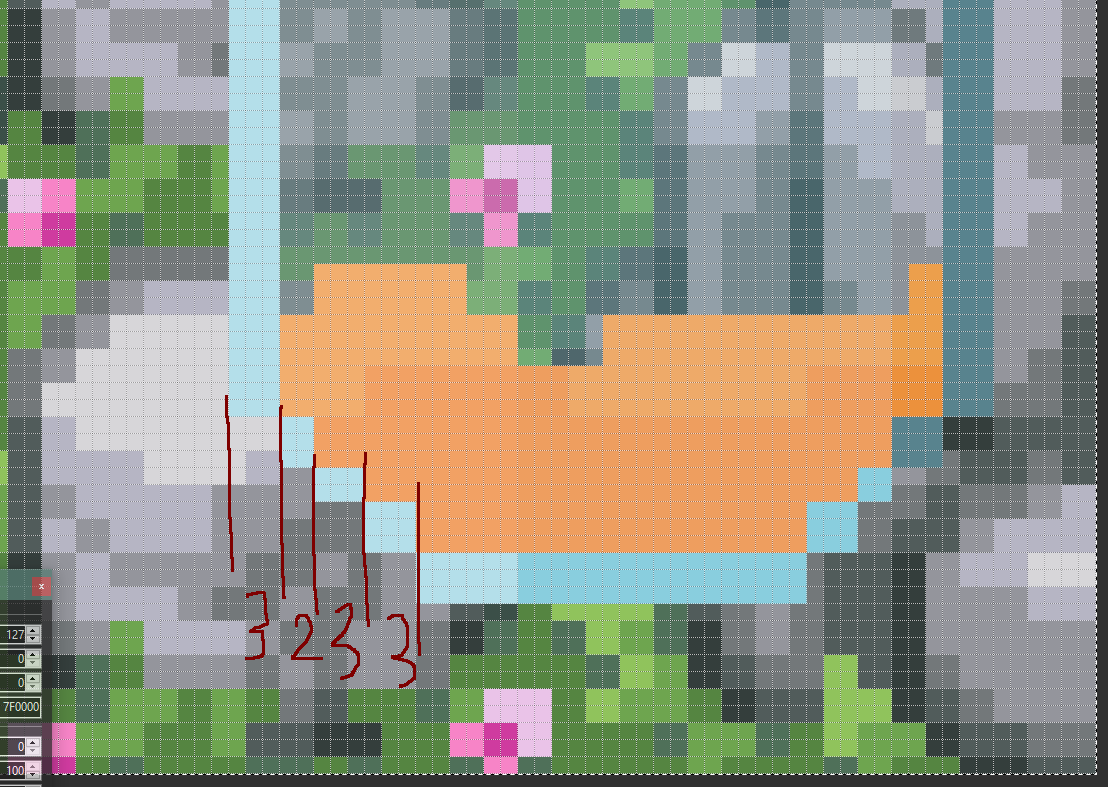
In this screenshot I can see that the menu tray buttons are at 2.75 scale or so, which gives inconsistent column widths (3, 3, 2, 3) and clashes with the 2x scale beneath them.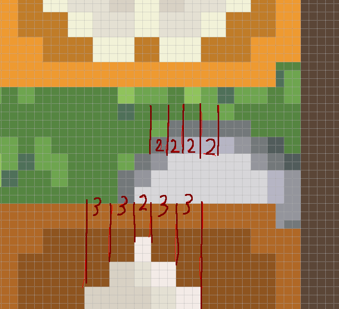
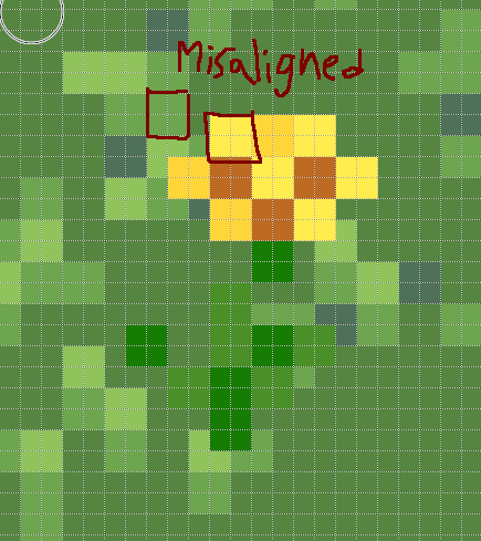
This flower isn't aligned to the pixel grid of the world. This is fine for moving things like the birds and leaves but for static elements you can notice it sometimes.
This Vial of honey on the right has the same issue as the tab buttons, it's at a non integer scale so with nearest neighbor it gets crunched a bit.