
Back again!
I made some more art, enough to have a full 8 cards. I slowed down on making them gameplay-functional, (I truly ran out of ideas), but when I do come up with things for them to do, I'll see if I can maybe make a trailer or demo video for them on Youtube. All depending on Alfred's permission.
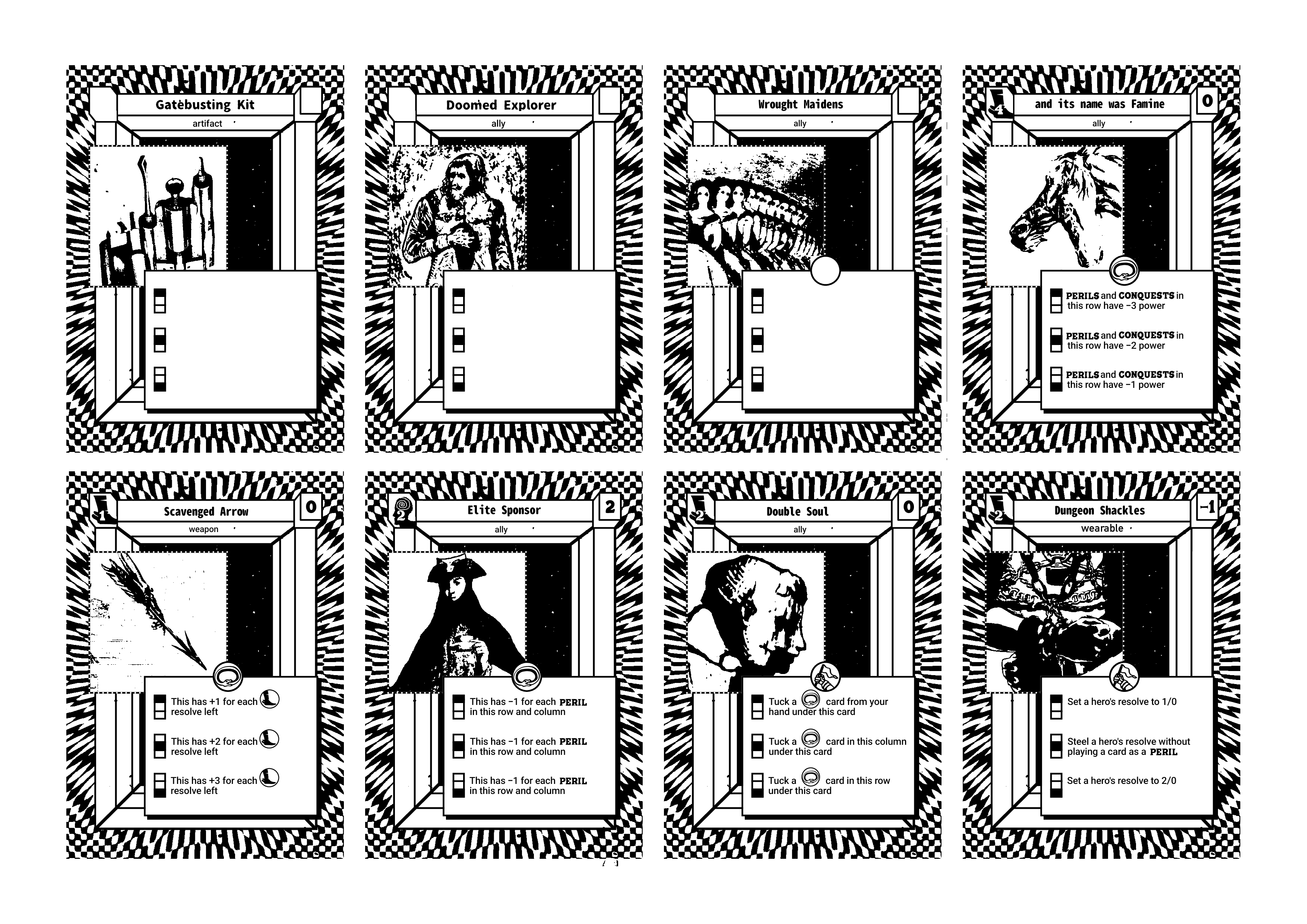
The three new entrants are the Gatebusting Kit, Doomed Explorer and Wrought Maiden. The kit is based off of clasic lockpicking kits and the such. I used a diagram of an old ad for a lockpick-proof-lock to make a bizarre looking tool. I imagine it'd work as a deck manipulation card, maybe having to do with the bottom of the deck.
The Doomed Explorer (I hope) gives more flavor to how dangerous the Fort is. And how someone outside the Heroes and their allies might end up. A man with a lethal wound from an encounter in the dungeon, finding the party too late to be saved, but maybe not late enough to be of use. Maybe he would cost less or even zero if one or more of your heroes is at 0 resolve?
And the Wrought Maidens are some sort of constructed group of noblewomen. Giving strength in numbers, and vulnerability in crowding. Maybe they'd have high cost but make ally cards in their column cheaper.
I also made some PERIL sides
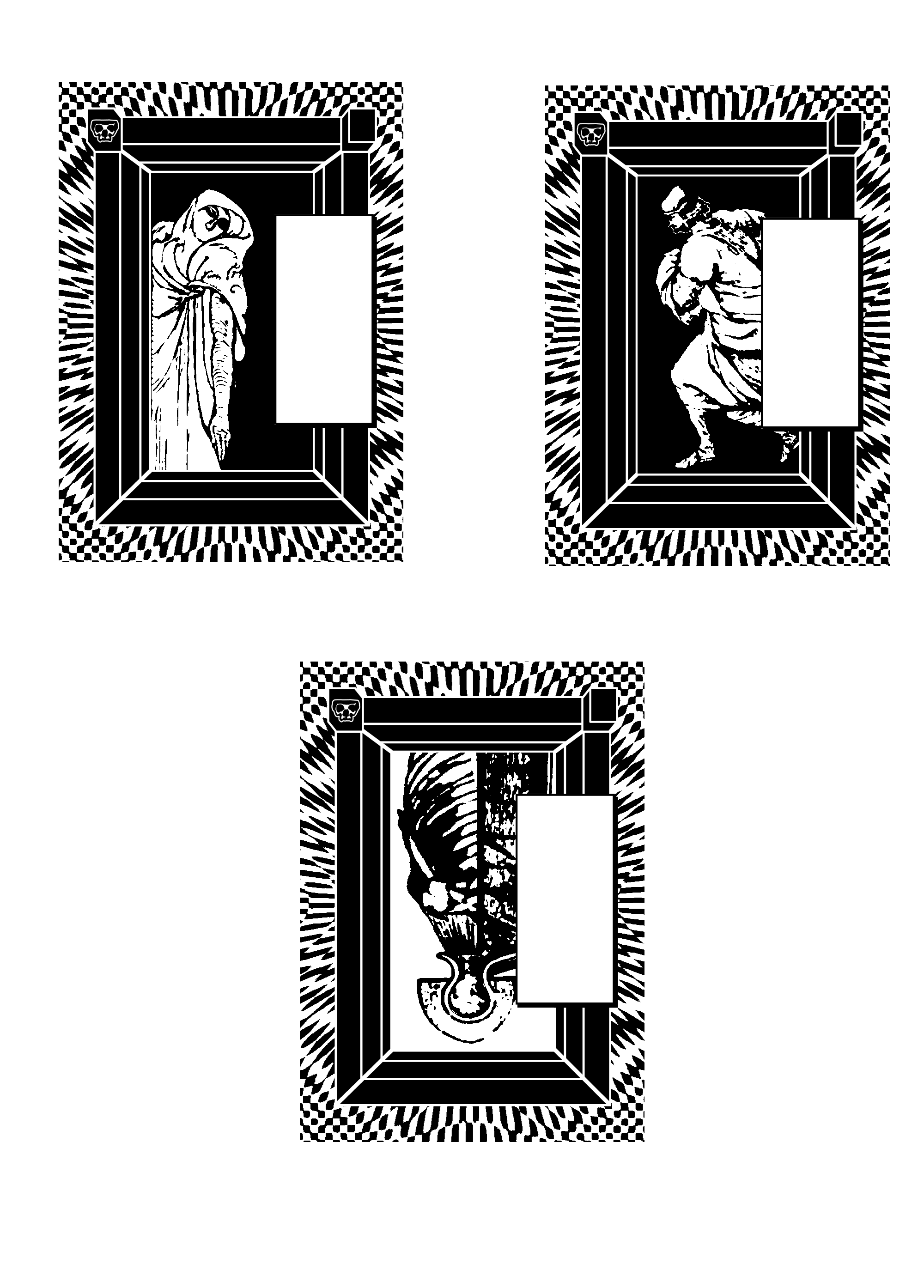
I like how they came out. The first one is for the Wrought Maidens. Some sort of protector figure overlooking them. The second one is for the Elite Sponsor, the Coward. And last is for the Dungeon Shackles. An iron maiden with viscera on its half. (It's a ribcage from an old anatomy book. Too gorey?)
I've been having a lot of fun doing these, and it's taught me a lot about different art techniques for the programs I use. I'll definetly try to make fully completed double sided cards, and print them out at least for myself.
Thanks for reading!