
Thanks for the response! Yeah about the trippy map design,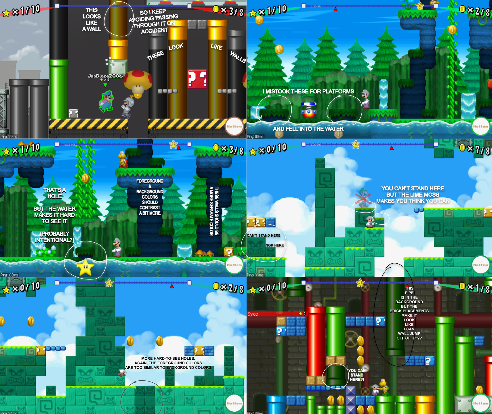
This is a collage of some of the examples that repeatedly trip me up. This issue is with only one or two maps, and I know not all of these are your maps, and in retrospect maybe it's just me who needs to adapt & practice, but these are the areas that catch me off guard in ways I don't think were by design (especially on the Factory map.)
The main issue is that the background colors can be too similar to the foreground colors sometimes. And with all the multiplayer chaos happening, it takes that much longer to plan a precise escape route. You end up losing momentum because you began planning to parkour around something that you didn't realize you can just jump through because it seemed to be in the foreground, or you end up trying to wall jump around an opponent just to pass right through what you thought was a solid object, and before you can process what just happened, you've lost a star.
Usually when an foreground object is pasted into the background, the designer shrinks its size to make its position clearer. For the factory map, those 4 pipes over the Big Red '?' Box could use those metal squares under them, like the one to the left, because currently, it just looks a bit off. Ultimately, it doesn't seriously matter; these maps are just fine and perfectly challenging, and it's probably just my poor eyesight. Again, great work compiling everything