Yeah, the higher the contrast the better, honestly (to an extent, of course; don't totally blow out your aesthetic, but yeah). Shapes are huge though, that helps a ton!
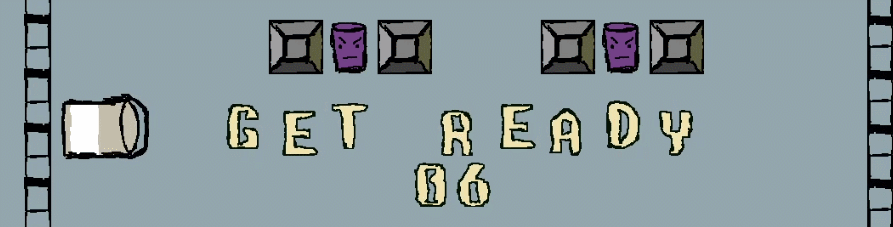
Now every enemy has it's own shape, which should make it more accessible. Still not perfect, though, working on the contrast.
That's awesome! Yeah I'd concentrate most on the circle and rectangle enemies, those are far harder to differentiate :) Great job!