Indie game storeFree gamesFun gamesHorror games
Game developmentAssetsComics
SalesBundles
Jobs
TagsGame Engines
(+1)

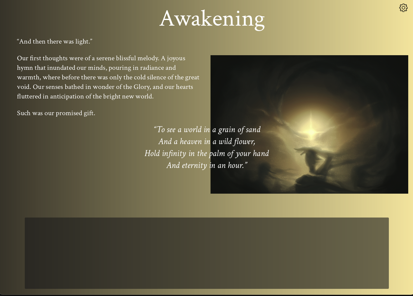
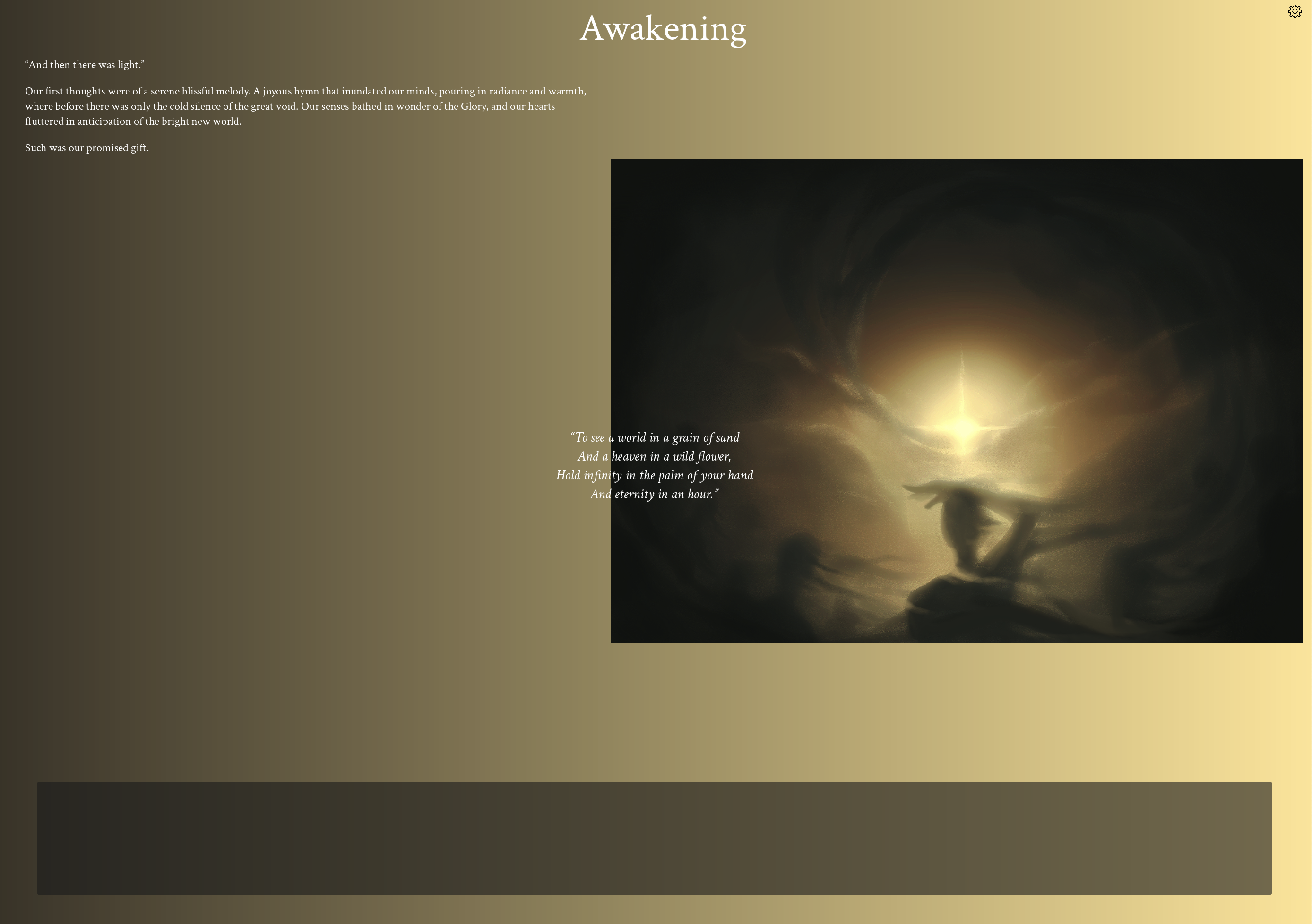
I'm including two screenshots. The same run on the same tab on the same computer. Just moving the window from the laptop screen (the one with the tiny text) to the desk monitor (the one with the not tiny text). The text rearranges itself when you move the window. This suggest the problem is in the dpi settings of the monitors. Nothing you can control on your end. That said, I work in Unity and it has some settings to make the text size determined in your choice of pixels, cm, points, screen size percentage, etc. Most of my games have little or no text so I haven't explored that to its fullest but I presume Godot will have something similar. 


You can also see the intro text stuck in the screen. This happens when you hit space while it's displaying. Something I have read impatient people do but I wouldn't know anything about that XD.

Now that I have learned I can read your game in my other screen, I'll have another go at it. Yay.

(+1)

Thank you so much for sharing those screenshots and your valuable insight! 💖 Really appreciate it a lot! I remember another player reporting the opening quote being stuck but I couldn’t replicate it myself since I was only using my mouse. Now that we know it’s due to pressing Space when it is visible, we can fix it. We will also look into ways to fix the text size and make it more responsive to different screen settings, or at the very least add accessibility options for the user to be able to control it themselves. So glad you decided to give our game another chance! Hope it provides you a meaningful experience. :)

(+1)

Definitely worth another go. It is indeed a touching experience. Beautifully done. Once again, the music is brilliant and the concept is quite original and well used. Really solid work.

A different issue I had now that I could progress in the game was that as I accumulated more and more cards, I kept begin forced to widen the window to fit them all. It eventually opened a second row but by then the window was already so wide that the lines of text become too long and uncomfortable to read. Also, in the moments when the cards start disappearing, being on the second row meant that I couldn't see what cards were disappearing from the top row and that's an important part of the experience. My instinct is to suggest that you stack repeated cards but that would lessen the effect of their disappearance, I guess.

(+1)

Thank you so much for your kind and encouraging words! 🙏 Really glad you liked it this much, it means a lot to me and the team!

I totally agree with you about the implementation of the bottom deck being quite rough, we initially thought about making it similar to BOOK OF HOURS by Weather Factory but couldn’t figure out a good way to expand and collapse the deck like that within the jam deadline. I like your suggestion about stacking the same types of cards, and I think it could work really well in our case since we only have 10 card types in all, probably can make the topmost cards on a stack burn away first so the visual effect is preserved. I’m definitely excited to revisit the project with all the wonderful feedback and valuable critique we received, and work on making it a more polished and user-friendly experience.