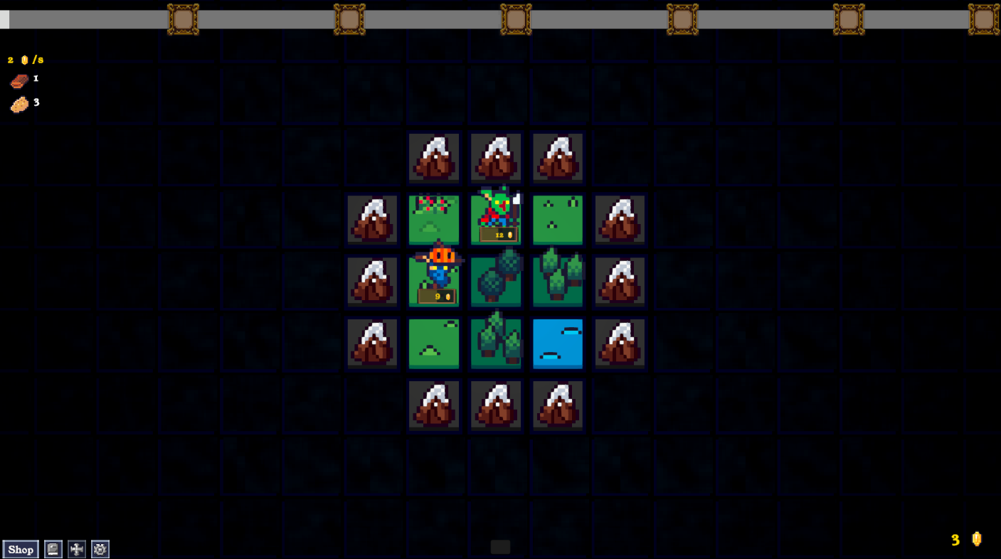
The concept for this is amazing and very interesting! I liked it a lot, but the UI needs work - the gold buttons are so big that they obscure a lot of what's going on, the sprites block the terrain information and it's hard to get an idea of what the terrain features may have.
Personally, I'd recommend either a hover over or click-toggle sidebar to the right that has the details of what the selected square and monster are, as well as a way to breakdown where your income is coming from.
Love the concept here, looking forward to the 1.0. Let me know if any more feedback would be helpful.
Hey! Thanks so much for checking the game out and leaving feedback. You're not alone in feeling that way about the UI. I've been working to resolve those issues to make it a lot clearer for the eventual 1.0 launch.
My demo will be releasing on Steam in February, but i'll also update it here if Steam's not your thing.
Here's a sneak peak of how it's looking (incase you're nosey). Placeholders galore!
Cheers!