
Some people might perceive the game as ai slop not because of its UI, but because of how many design decisions appear unfinished or inconsistent. Here are a few examples that illustrate this:
-
Mega-Party costs significantly more than Care and Cleaning combined, yet their effects are nearly identical. It feels like the feature was added because a product manager asked for a shop system, but no clear decisions were made about what the items should actually do—and the developer or the AI(if exist) didn’t push back or ask for those decisions either.
-
Buying supplies is located within the Management screen, while hiring Room Service is placed in its own separate screen. On top of that, supply costs scale upward like a hiring mechanic rather than a purchasing mechanic. It gives the impression that the PM requested a management system and a room-service system, but didn’t define their behaviors clearly—and again, the developer or the AI(if exist) didn’t request clarification.
-
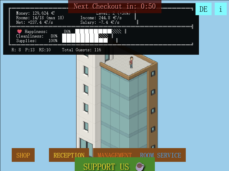
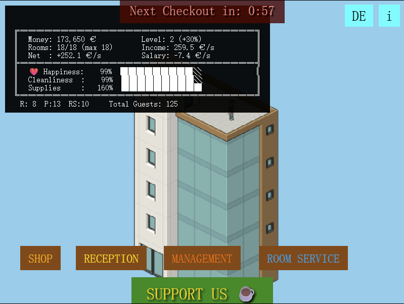
The UI itself isn’t bad, but many elements overlap or crowd each other. These problems are extremely simple to fix—often just a matter of adjusting a few numbers or changing spacing. Even as a backend developer, I could correct many of these issues quickly. It makes it seem like no one—neither the PM nor the developer or the AI(if exist)—took the time to think through the layout or visually verify the results.
Before:
After:
btw, Bug report:
The Income / Net display currently shows a fixed value, but the actual income fluctuates every update. Since the net value is already calculated inside update(), the UI should reuse that calculation instead of relying on a static number.
This matters because the displayed income is misleading. When inspecting the code, the actual income is being divided by 60 in game.js (line 178), which has no apparent justification. As a result, the Income/Net display is incorrect even before taking the mood modifier into account.