Thank you!
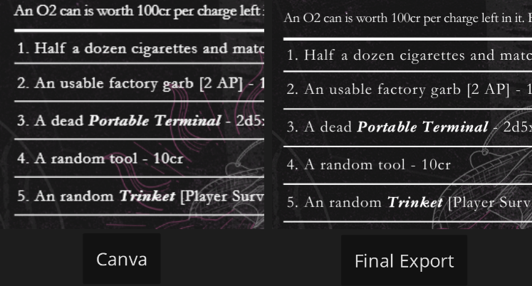
Yes, I am aware the font is too thin. For some reason, the final export of the Canva final made it alot thinner than what the preview showed. But I've also darkened the background slightly to help with clarity. I will be changing out the font regardless. The inconsistent number was also something I noticed literally a minute after the deadline ahaha. But it has been fixed; it should have been 6. The diameter of the station is one I did not catch and I'll look to revise it accordingly; thanks!