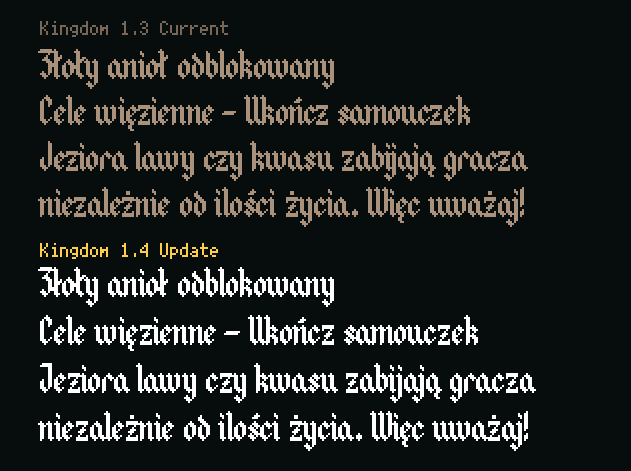
Here is an example showing the current (1.3) and upcoming (1.4). The new update improves kerning and glyphs in some areas, coming in a few days.
I take on board any suggestions/feedback if you catch any inconsistent rendering.
Here is an example showing the current (1.3) and upcoming (1.4). The new update improves kerning and glyphs in some areas, coming in a few days.
I take on board any suggestions/feedback if you catch any inconsistent rendering.