
The REPLY!
₊˚ ✧ ━━━━⊱⋆⊰━━━━ ✧ ₊˚
Review
Solid update. Removing the random upgrades for the miners is nice, the prestige is awesome. The auto click upgrade is great. Thank you for implementing the swipe to scroll! (unless it was there all along and I’m crazy!) Keep it up, this is great. Now allow me to yap.
₊˚ ✧ ━━━━⊱⋆⊰━━━━ ✧ ₊˚
Potential issues
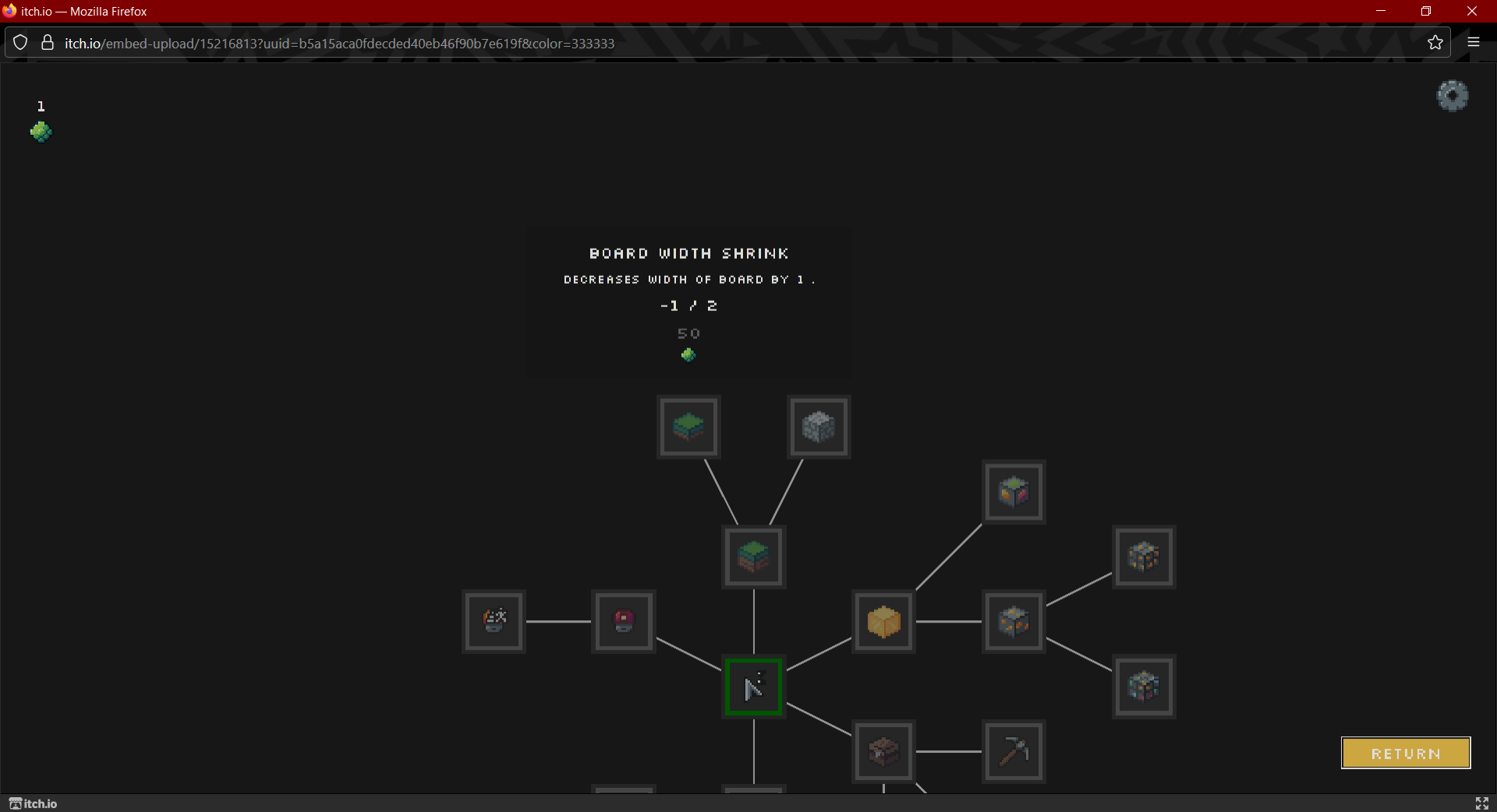
Prestige menu specific
This probably shouldn’t be -1
The animation of the spin on tooltips is definitely WAY too much visually… especially on large displays.
Bought upgrades should be distinguishable from buyable upgrades (ie locked = black, buyable = red, bought = green)
An emerald (I think that’s what the currency is right?) display, smaller and below the coin display
Other:
The minion count upgrade is incorrect occasionally (It will say 3 >> 5 then upgrading makes it go 4 >> 6, for example) ₊˚ ✧ ━━━━⊱⋆⊰━━━━ ✧ ₊˚
Suggestions
Dirt, stone, and so on should have a small value imo. Like 1 from dirt, 3 from stone. I think it would increase the engagement and lil dopamine rush from the coins more.
The blocks could also shrink from damage some, kind of like how they do in the click animation at first? This might be annoying to implement, so don’t sweat it if you don’t wanna.
Add some deadzone to the scroll so clicking and moving from ore to ore at the same time isn’t potentially gonna scroll. Something like 50 deadzone. If you’re using a scroll container directly, you can implement it easily. If it’s your own system… let me know, cause I have code for that kind of thing just lying around for some reason :)
Once you prestige once, you should be able to access the menu to view your upgrades whenever you want.
This one’s a big option but with the prestige, I think saving and loading is a worthy investment. ₊˚ ✧ ━━━━⊱⋆⊰━━━━ ✧ ₊˚