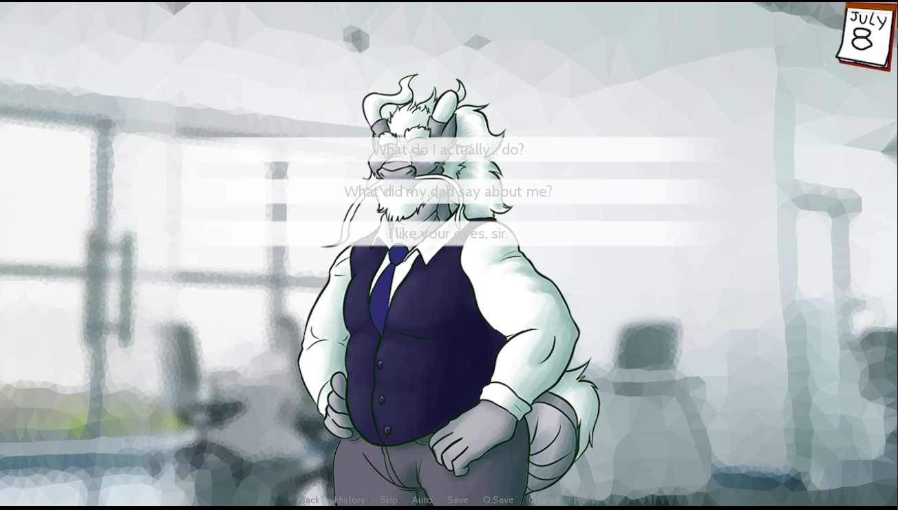
Also, I'm sorry if it's naggy, but I found the menus a bit hard to read since I had to specifically hover on them to be able to read them... I felt it was a deliberate choice on the very first scene like this, 
but I also found it a bit hard to read the menu choices on the normal scenes... I think a bit more contrast between the text box and the dialogue box could be helpful