
Pixel Study #2 – Isometric Iron/Metal Cube
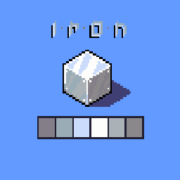
Here is my second attempt on the study of pixel art materials and I continue with iron/metal. Also in this case I tried to reproduce shadows and lightsin a realistic way to give the idea of ”shiny” metal.
The procedure was always to start from a basic palette, that is, to establish the colors relating to the three faces of the cube and then to understand which half tones were good for each shade.
Armed with a brush, ink and eraser, I jotted down a few somewhat chaotic highlights and gradually refined them… then I added those dots to give the idea of an erm… box? I don’t know, the result isn’t bad but in reality I’ve never seen an object like this! :D
This time the hardest part was to diversify this from the gold so as not to look like a simple copy and paste, and with a different pattern of highlights and shades I think I succeeded!
Well I’d say we did this in some way too! Now it’s time for wood…