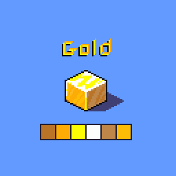
Pixel Study #1 – Isometric Gold Cube

As part of my learning process in pixel art, I’m experimenting with different materials. This time I tried to capture the look of gold, using simple isometric shading to practice light and reflections.
The goal of these studies is not just to create assets, but to build a stronger sense of how light, contrast and color palettes work in pixel art. I use Aseprite (beginner) and just brush, ink and eraser tools.
I wanted to obtain a pleasant and faithful result that recalled gold, with all its reflections and sparkle, but not too complex.
I tried defining the basic palette, starting from one color and choosing the others lighter or darker. I painted the three faces like this to obtain an acceptable shadow, then gradually I enriched it by adding other half tones and highlights.
The biggest difficulties were choosing the halftones for the shadows and the patterns for the highlights.
Gold doesn’t have a rigid pattern, but too chaotic didn’t seem realistic, the real challenge was to balance something that was pleasing to the eye and not too overloaded
I’m very satisfied to be a first attempt!
Next step will be exploring other materials (iron, wood, glass…) and gradually expanding these tests into usable tiles and sprites.

