
Here's my suggestion to rename a few things and revamp the UI to streamline the gameplay abit so it could be a bit more intuitive:
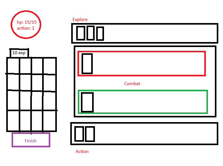
Phases:
1. Explore: Explore box highlighted, player clicks on card, card moves down the combat box.
2. Action: Action box highlighted, player clicks on card, card moves up the combat box. If the player clicks on a special card, like extra action or something, it will be consumed immediately. Auto transition to the combat phase when action reaches zero. If there is no action can be played, just transition to combat automatically.
3. Combat: Popup said "Combat", combat box for player highlighted, player to select what action to do on what monster. After all actions used, auto highlight combat box for monster, player select what monster execute first, auto transition to buy phase after all monsters are selected.
4. Buy: Buy box highlighted, All the exp cards move to the shop to indicate exp is going up, the player buys stuffs as normal, turn end and restart the whole thing when player presses finish.
Attempt to be more intuitive:
The idea is to make the UI more intuitive, a clear what can you do (action) and what are the objectives (explore) on the opposite sides like a sane card game.
Introduce a combat phase, it's just basically merge the "select enemy to attack of current action phase" and "select monster to resolve", so it can be a separate box so we can highlight it and more inline of what a generic rpg card game would be.
Attempt to be more automatic so that we would have fewer buttons to click.