Ahah, don't worry, during jams accessibility often has to be put aside, you are far from the only game with colour issues, and yours is really minor ^^
But if you want to make a complete version, since colour is one of the major parts of the gameplay, you're right to think about accessibility, and I'm glad to be able to help!
The best Colourblind Mode is a careful design
By carefully picking the main colours, you can prevent the need for any CM! Introducing the colour wheel: try to get as far as possible between the selections in order to minimize overlap. You did a great job with the red, yellow and blue (see screeshot), but the purple is close to both blue and red (for obvious reasons ^^).
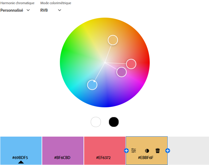
Since the purple is closer to red than blue (let's say around 2 reds for 1 blue), people with red-type deficiency like me will be mostly ok telling blue apart from purple (2 red + 1 blue - 1 red = still purple), but for blue-type ones it could be a lot harder (2 red + 1 blue - 1 blue = 2 red).
Of course, don't throw away all your design choices in order to pick the furthest colours possible, sometimes the "right" choice is far from a pretty one, and your game has its identity with the colours you chose.
If you want to keep the same ones, what you can try is to shift the brightness: a dark purple and a bright blue/red will be much easier to tell apart! And you don't even have to go all the way to black/white, even a slightly brighter/darker shade can make a lot of difference. ^^
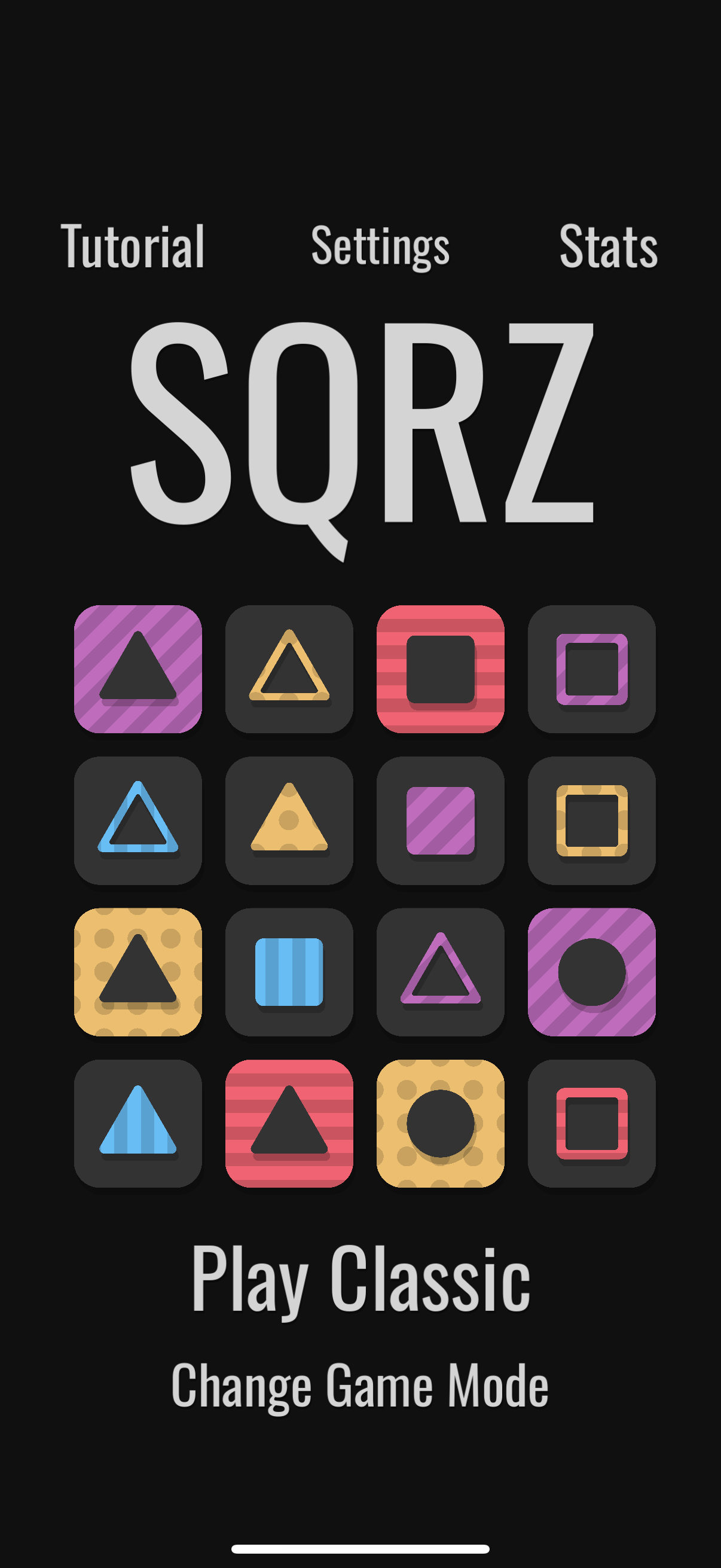
Also, it helps to know the source of the confusion: the only blocks I really had "trouble" with were the line-style ones, since they don't have a lot of surface and the game needs you to act fast. Increasing the line thickness by a little could work too!
Colourblind mode
Even though an excellent design can be its own CM, when colour is a central game mechanic, it could be a good idea to add accessibility options, just in case.
Depending on the game, a CM can differ a lot. Here, since you need the player to tell blocks apart at a glance as soon as they appear, adding stripes or a letter to describe the colour could work! To activate the stripes, you just need a simple toggle switch in the options.

But if you don't want anything else than a plain colour on the block for design reasons, the best solution would be, if you have the time to implement it, to let the player choose its own lot of 4: you preselect let's say 6~7 colour (including the 4 ones you already have) and in the options, the player selects the four ones he's the most comfortable with! Something like:
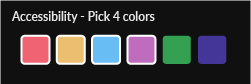
(the two additionnal colours are only here for the example, feel free to change them for anything that fits in your current palette of course ^^)
------------------------------
And, voilà! All the advices for accessibility I have, tailored for your case! Feel free to pick and tweak whatever works best, these are just suggestions. Hope it helps if ou ever decide to work on accessibility! =D