The UI feels so cramped but I feel like the main reason is that it takes so much space along the bottom that there is no space to view the map... if it was at the side then that would help a lot and also mean that the (terribly optimised) conversations were not blocking me from building the things they are complaining about that I haven't built yet! (I might also not that the lag of the text writing got so bad that one the three drop pods had landed I wasn't able to read almost any of the conversation because the next part happened too quickly for the preceeding part to finish being written (mainly because it paused so much every three to five letters - space included).
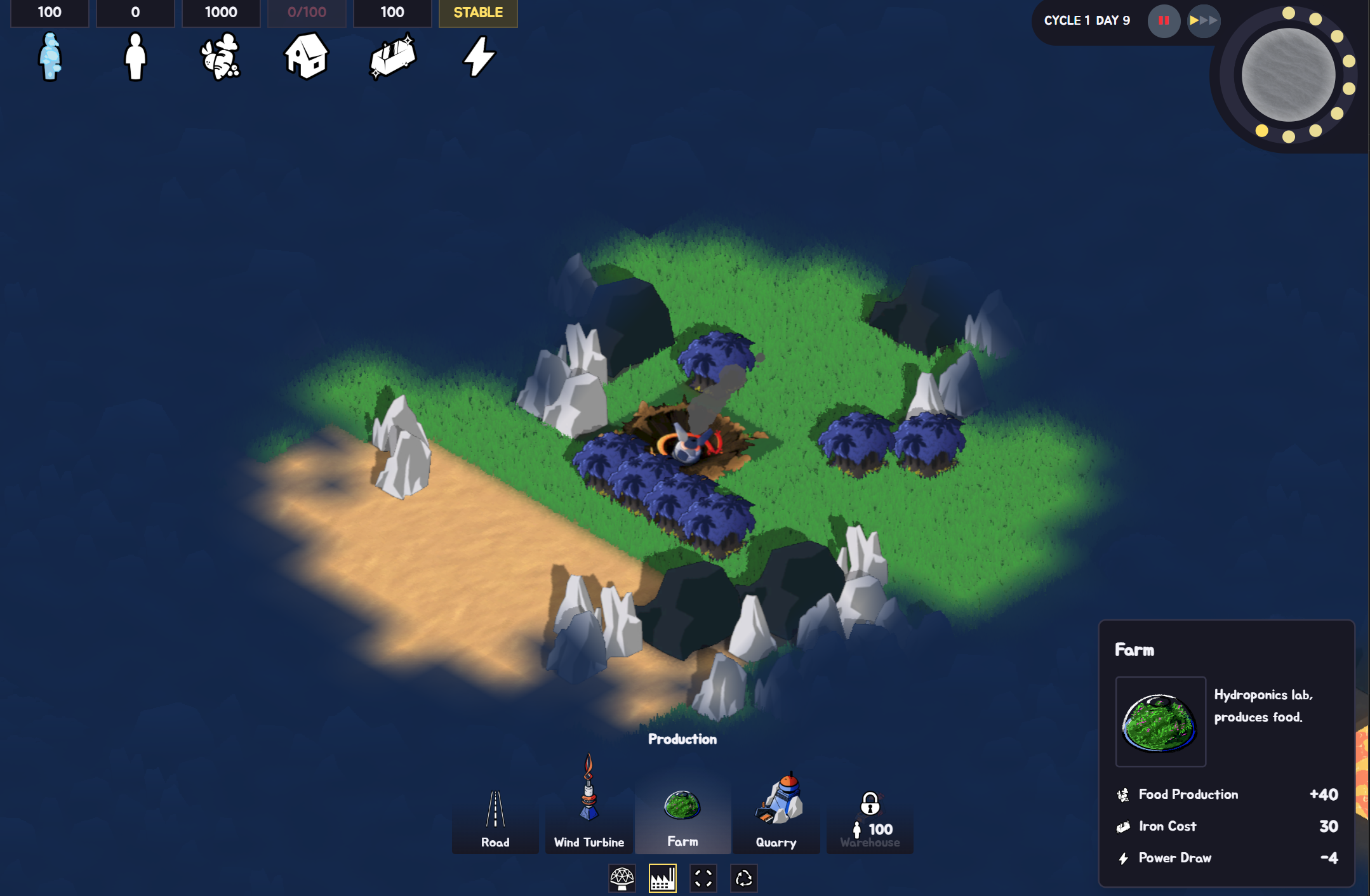
I guess the cramped feeling also happened because my map was nothing like the ones shown in the screenshots; mine was scattered with ore mountains, forests I wasn't allowed to touch (future food areas?) and black mountains... I had one single four by four area where I could build and everything else was two wide strips... even the desert was bad... maybe just a bad seed?