

I'm a long time adult game enjoyer and someone with a background in graphical design / UX.
This is about the third time I've downloaded Strive: Conquest and tried to get into it - the first two times I bounced off hard from the unintuitive new player experience even though I loved the first game. But now, after some trial and error and some patience, it finally clicked.
The game is so much fun. The combat is way deeper, the class system with all the unlocks feels rewarding and you keep discovering new stuff even after dozens of hours into the game, the factor improvements always keep you looking for new characters, and the search for that perfect girl with the perfect trait + race is incredibly engaging. This game is a step up from the first one in so many ways.
But the one thing that it needs - and I know it's still early access but I cannot stress this enough - it needs to get fixed is the User Interface / Experience.
It's clunky. It's confusing. It somehow manages to be cluttered with useless info and not displaying vital things at the same time. The transitions make you feel like you're playing with persistent lag and the tooltips are either vague or nonexistent.
I firmly believe that this could be the best management type adult game to date, but even in early access, this must be prioritized. Because these type of games, from Brothel King to Lab Rats 2 - all of these games ARE the user interface. Like, the entire game is screens and statistics and the navigation between them. To have an even slightly clunky experience can turn away 90% of potential players who would have otherwise loved everything else about it. I want to see this game succeed so much, so I threw together a little suggestion compilation for the main base screen.
Keep in mind that these are just my small, quick to make suggestions and by no means the exact way the UI should look. The idea is to display relevant information and to have easy access to all the things players want to reach with just a few clicks.
Before: 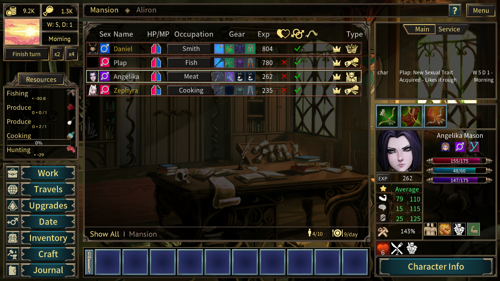
After: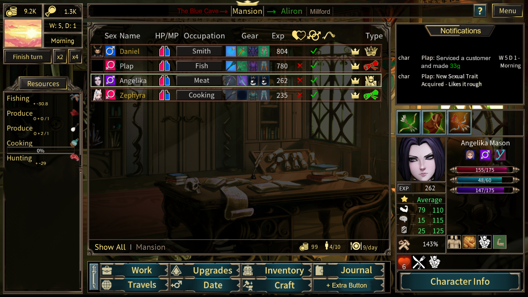
Explanation: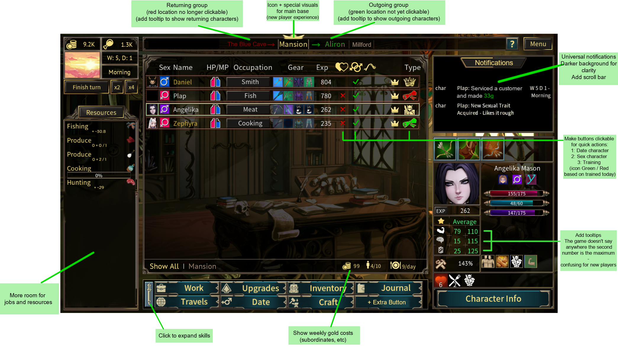
This isn't everything of course, but it's a start. I tried to caption all the parts I changed on the mansion screen.
- Going from the top, for a new player it can be very confusing to know just where your character are / how the location system works. Having little arrows that show movement for visual learners can be huge - with tooltips that display which characters are on the move!
- Having the "main" and "service" separated on the right part of the screen was always kind of confusing to me. It would be easier for players to have every relevant non-resource/crafting/upgrade based notification in one place, preferably with a scrollport. And color highlights are always nice on the eyes.
- I hope I'm not the only one who was getting frustrated by the experience of having to click through 3 screens just to check if my girls could be trained. For each of them, individually. A little color indicator could solve this issue under the "type" column, and if you could click these icons to instantly reach them would be even better, like quick dating. (I know in the example image the highlight is for subordinates who can't be trained, but you get the idea).
- Just a small nitpick with stats - I know you very quickly find out what the second number means, but I wasn't sure as a new player. A neat little tooltip would clear this up :)
- The fact that subordinates cost weekly gold is not apparent from anywhere in the menus. Which, for a management game, is pretty darn important. A total outgoing gold counter would be nice.
- The skill bar on the bottom takes up way too much space for how little you use them. Sure, the Mentor skill is something you can cast every day - but even that you should be able to automate since it has no mana cost. Making a little collapsible button gives a lot of extra space to work with.
- The menu buttons could hop over to the bottom, opening up way more space for the resources tab - which is the most important section in these type of games. Seriously, I was kind of baffled how little emphasis the UI puts on getting new resources. For example games like Brothel King puts a completely separate screen for your daily gains - so having just a little extra space, plus maybe green "+4 Leather, +7 Fish" floating numbers would be nice for that sweet sweet dopamine.
- Another big suggestion that cannot be shown on this graphic: please give players an option to disable screen transitions. That little fadein/fadeout effect whenever you open a window or switch a location or click a dialogue response? It feels awful for a game of this type. It feels like built-in lag. It's an artistic choice at the cost of functionality - which is completely fine! A lot of people prefer it! But it can get a bit grating after hours and hours of gameplay and having the option to disable them would be a massive boon.
- Also, it's a bit disappointing that the girl image is not displayed during sex. Maybe a little section on the side that you can toggle / switch between character full body avatars if you want? Could be neat.
So that's pretty much all I could come up with in a single go. I absolutely, passionately fucking love this game and I want as many people to experience it as possible, and having a positive interface experience for a game constructed entirely of interface elements is huge. There's so much potential here, held back by this one little technical hurdle.
Thanks for reading. Now, I'm gonna go back to my girls and see what act 2 has in store for me :)