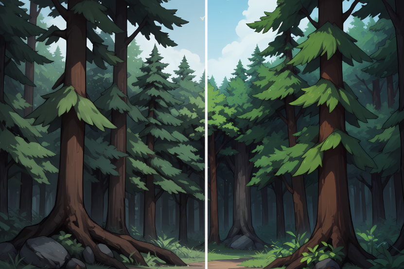
Some opinions on the backgrounds indicate they do not match the tone of the original, which is fair, they are indeed more colorful and less photo-realistic, so we’re testing with saturation of the images to find a sweet spot between tone and keeping the new artstyle.
This is an example of the Forest background with less 30% saturation, let me know if it looks better, worse or if we should increase/decrease saturation.