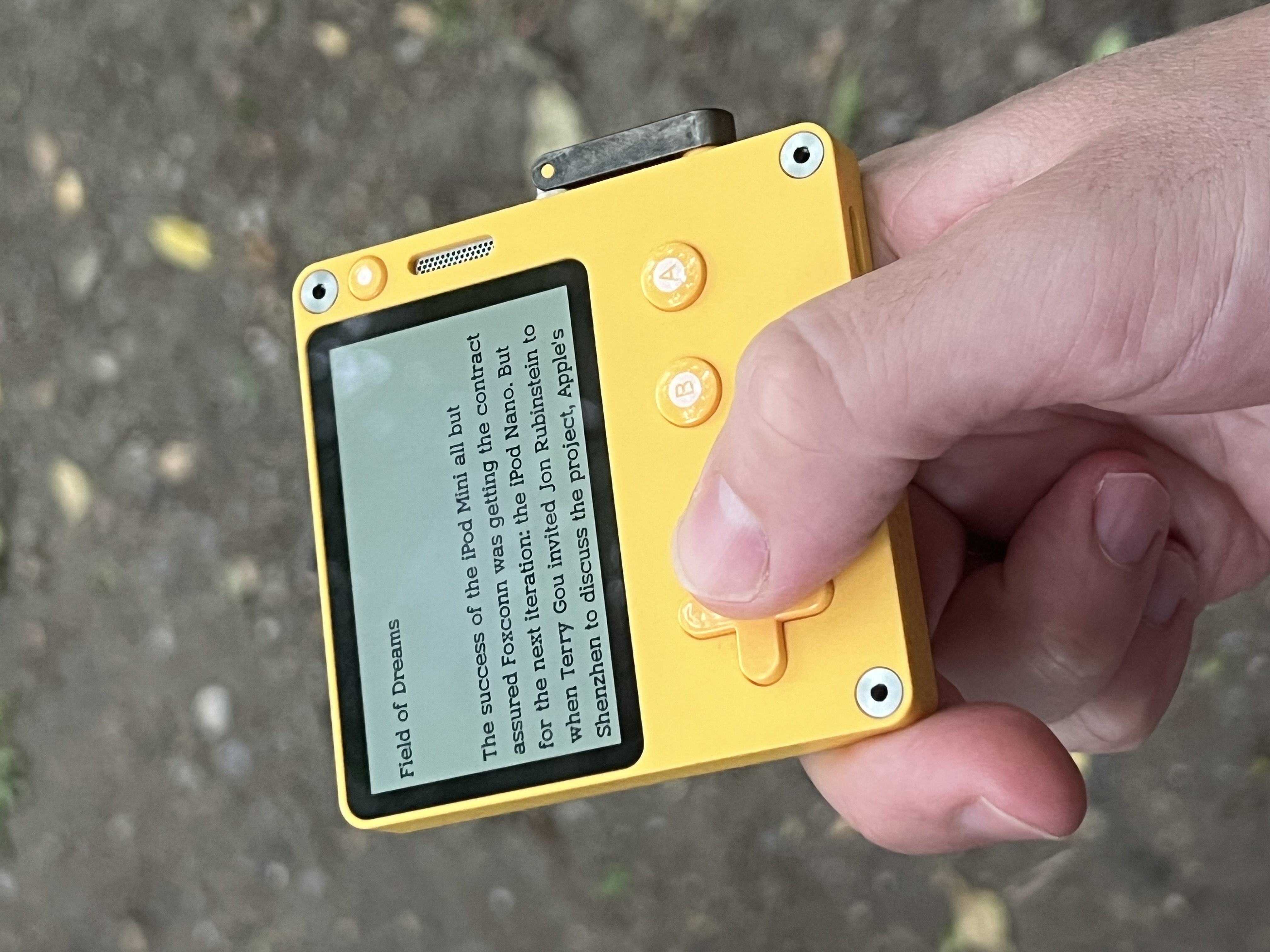
The font used in PocketReader (also on Itch) works well. It’s chunkier without being overtly bold or semi bold, which is how I understand the titles in PlayNews to be. I like the way you currently have it where the titles are a different font-weight to the body text.