
Really cool, i like this a lot more than your other game. Kind of like Kerbal, but the world feels REALLY big.
First time player experience needs smoothing:
I want to launch spaceship:
I cannot launch spaceship (I have to design a ship first) (just give me a default ship for now)
I go to ship design, i have to choose a hull (Could have chosen the only possible option for me, and later the last option you chose)
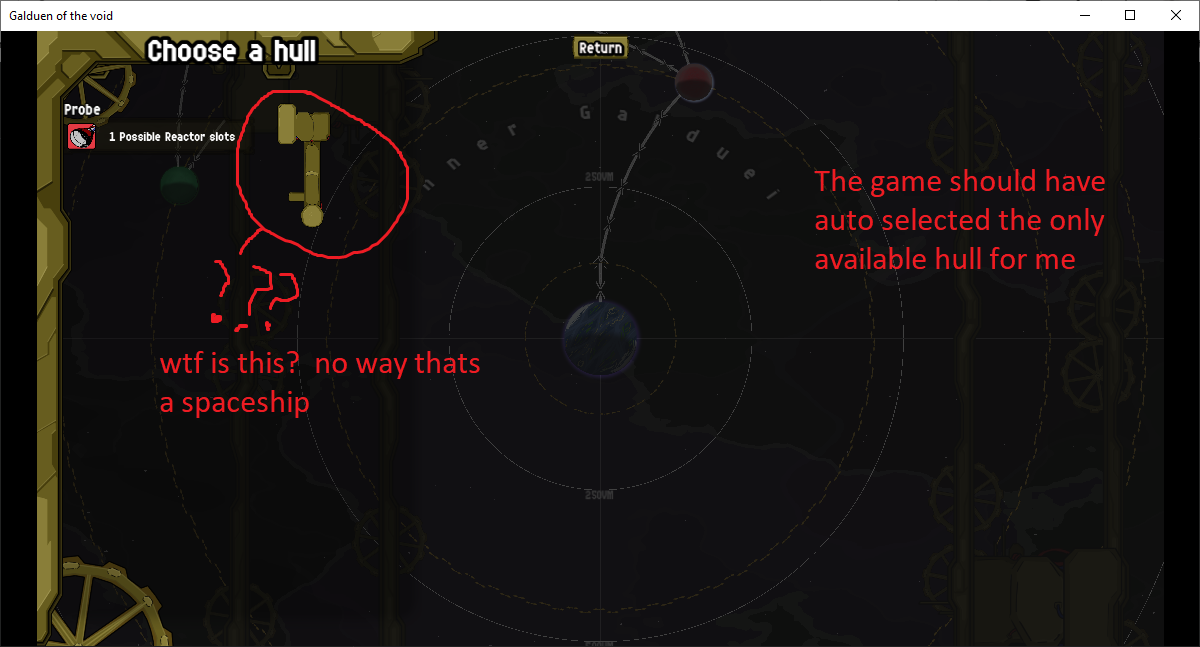
I choose a hull I have to "Create a new design" ("BZZZZZ YOU NEED TO INPUT NAME" Just give me a default name)
Ok now i actually get to build my ship, this is fine
Now Im back at the main screen and its weird again.
I want a big green button that says: "PLAN EXPEDITION" and to just start planning my spaceship
instead i need to... enter a submenu and do this entire 3 click process manually
Its a lot of friction. Every time a player has to click something, enter a menu, before they can "play the game" is a wall thats going to block some people off. and the people that don't give up will still be annoyed by the tedium.
Every time you have to play the "BZZZZ" error sound you should cut off one of your fingers, because thats how annoying it is to your players and there's probably a way for you avoid having to do it.
This is my take on a UI that could reduce friction and just let me play the game right away easily:
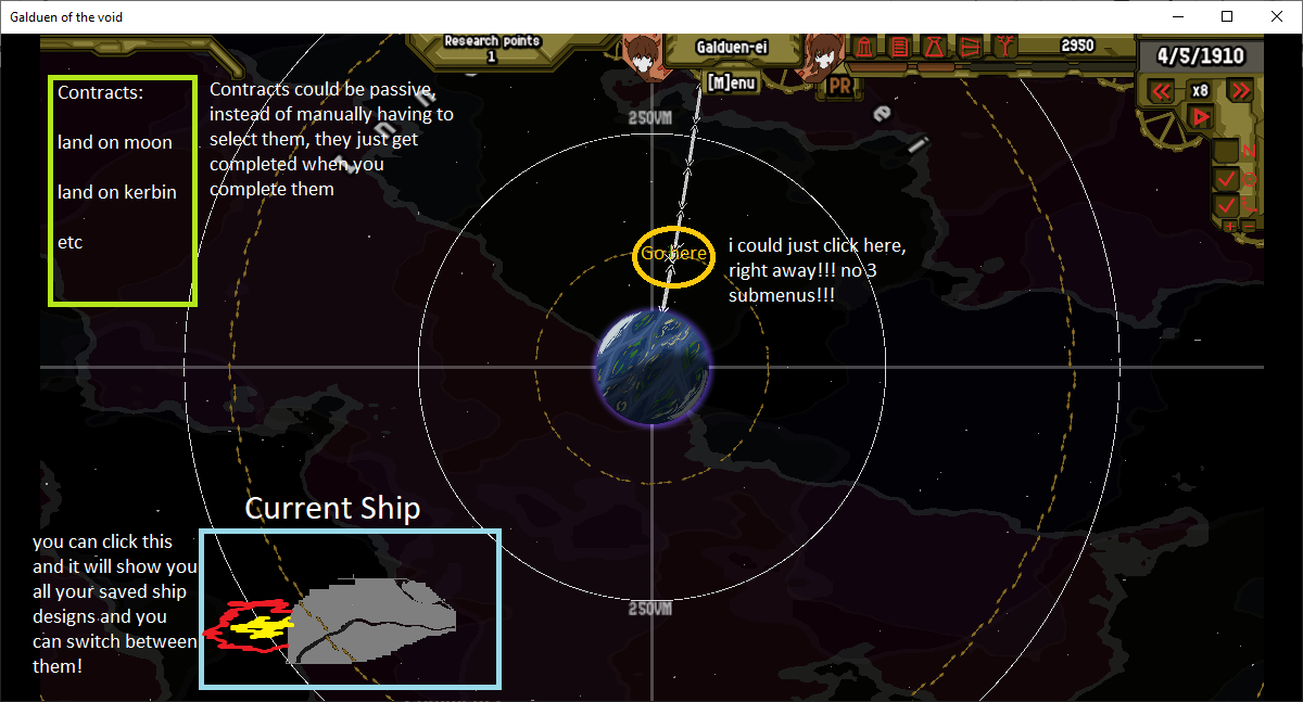
So it would be better if i can just get started with a default ship, and then when i want to upgrade, i can.