
Indie game storeFree gamesFun gamesHorror games
Game developmentAssetsComics
SalesBundles
Jobs
TagsGame Engines

Pixel art advice

A topic by nanto2016 created Mar 21, 2025 Views: 98 Replies: 2
Viewing posts 1 to 2
Submitted

Hey, I'm drawing wooden floor planks and I really can't get them to look good. It feels like the colors of the palette are way too different (I mean that there are not many in-between colors for shading). I'm a total beginner so I really don't know much stuff. By the way I use Piskel for pixel art, it's very simple but it works.

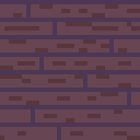
Here's what I have so far. It tiles pretty well but it looks kind of horrendous in my opinion. I tried switching the colors around but I found very few good results. Maybe the planks are too small? Maybe I could make this "fantasy wood" and add weird colors and patterns to it? If so, how???

Any advice will help, even if you're not sure about your advice I'm willing to try stuff out

HostSubmitted(+2)

Hey !

I'd try mutliple things:

  • Maybe break up the full lines that represent the planks, and let people's imagination fill in the gaps.

Here are some examples of it used on sprites:
 

On the table, the planks are somewhat implied, and on the fireplace, the rocks on the side are.

The idea is that the brain is really good at connecting dots, so you can levrage that and not draw everything. you just need enough for the brain to understaind what's happening. That's usually good to use when there's a reapeating pattern but drawing it all adds too much noise to the image (I think that there's a bit of that here).

(It takes a long time to have something look good with this technique, and it usually look quite messy at first.)

  • Maybe use the darker / lighter shading colors to draw the plank edges. This goes a bit with the previous tip, it may help to imply the planks and remove noise (I'm doing that quite a bit with the fireplace).
  • If you wanna try other colors, try to add the darker shade of purple as well. There is way less contrast between the dark brown and dark purple colors in this palette:


On the same note, you could try to use lighter colors, because there's less contrast between ligher colors (and as such, you can have more color variations).

You could also try to use (blue + green + purple) colors or combinations of those for the wood instead of brown + purple. It would go more in the "fantasy wood" your talking about, but maybe it'd look good (?).


There is probably much more you could try :) But that's what I can think of rn.

Submitted

Wow thank you that's so awesome! I'll try that :)