
Ah, I see, it seems that it's an issue with specifically the html version of it. (For some reason the html version offsets the health bar, no idea why, there's no code telling it to do that.) So I've adjusted the html version's health bar placement so now it shouldn't overlap anymore (hopefully). Have also made note in the code to make sure I adjust it between versions so hopefully I won't forget that little adjustment with future udpates, but at least if I do I now know the fix for it.
1 year ago(+1)
Should have the visibility for this fixed now. Feels like a very ugly bandage solution for it and I wish I could just have the text behave and be where it's supposed to be. Going to keep trying to find a better solution to what I've got now, but have shoved the max HP value down by two lines so, though it will be far away and looking misplaced, it will at least not be randomly overlapping.
1 year ago(+2)
Good news, turns out I've figured out a more proper fix to it all. I have simply made all of the text be the one with the different spacing that is required for the coloured ones...I do not know why it took me so long to figure that out, but having all the spacing more pronounced like that should make sure there's no overlap AND make it look less messed up.
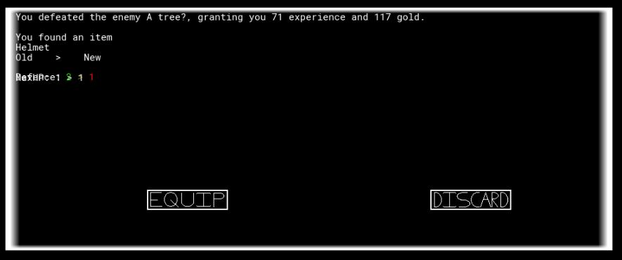
So, I might have accidentally found the fix for it. When going about and making the spacing of the stuff all use the new text, I noticed that I'd forgotten to have the item defence call the correct object when it was equal to your current equipments defence, so that's probably where the undefined was coming from, so, it should actually be fixed now too. If it still shows up at any point, grab a screenshot and I'll see what I can do to fix, but hopefully should be good now.