
Fun game but as a person with not the best eyes the font makes it impossible to distinguish between the d10 and the d20. Like in this image can anyone tell me whether this is a d10 or a d20? I genuinely have no idea because I would assume it's a d20 but on what I thought was a d20 run I had nothing but d10's so 🤷♂️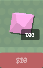
Glad to help. Bearing in mind that I'm not a game developer so I don't know how difficult this would be to implement but one suggestion I have that could maybe fix this problem would be to have several font options to choose from some of which might be larger or more clear for people with bad vision. But again I'm not a developer so I don't know if that's a reasonable fix