
Indie game storeFree gamesFun gamesHorror games
Game developmentAssetsComics
SalesBundles
Jobs
TagsGame Engines
(1 edit)

Hey 👋 First of all, I really like this font family, started using it for my game. Really good work.

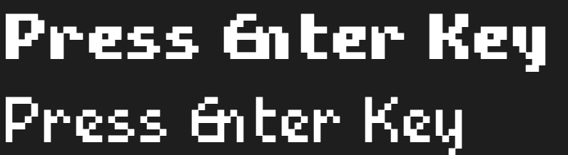
One small bug I found: I noticed that in the small font variant, when typing a word like "Enter",  the kerning between uppercase “E” and lowercase “n” is too tight, and between “n” and “t” it's too loose. I suspect perhaps the letter “n” is shifted 1px to the left by accident?

Holy this was posted a year ago and I TOTALLY missed it. I just had the same bug reported by another person. I’m terribly sorry, I wasn’t ignoring the post it just got lost in the notifications.

I’m looking into a fix for this now and will update the fonts once I’ve figured it out.