
Actually, the card game is really neat! I let an hour pass just playing random matches ahaha!
Although, I have a few things that I feel like could make the card game feel a lot better to play. Don't worry, it has nothing to do with changing gameplay or adding animations just yet.
In particular, it has to do with how info is displayed on cards in your hand.
This is just nit picky stuff, and it could just be stuff you haven't added in yet, but I still feel like I should mention. There is zero feedback. I know, this is probably just going to be a polish thing, but consider playing a sound when the player clicks on a card that they can't use. Maybe flash a related icon on the screen. Say, the player clicks on a card that needs the player character to be male but they're female, flash the gender icon that corresponds to the players sex and catch the players attention.
That's all of the stuff I believe I need to say. If I come up with anything else, I'll tell you.
P.S. I love the playing card art! It's just gorgeous!
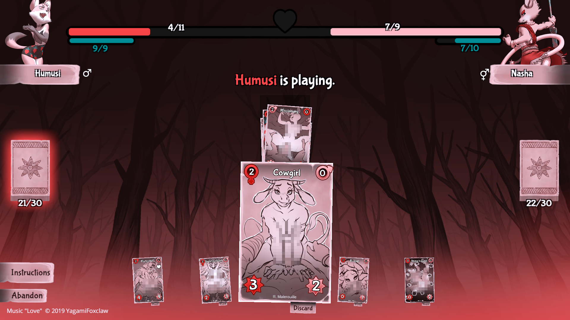
 That's right! Full colourblindness. Also known as Achromatopsia, it causes a person to see only in black and white. I noticed while going through these filters that this last one is slightly problematic. To be specific, the two bars next to Humusi. Both of the bars are usually very distinct from each other, but in this case, both have an extremely similar contrast/brightness making the bar fill seem effectively identical in appearance.