
Great game! I played through it several times. Every once in a while there would be two towns next to each other and the dearth and surplus would match up nicely, making for good profit.
Play game
The Merchant of Mors's itch.io pageResults
| Criteria | Rank | Score* | Raw Score |
| Audio | #8 | 3.062 | 3.750 |
| Art | #9 | 2.449 | 3.000 |
| Gameplay | #10 | 2.449 | 3.000 |
| Overall | #10 | 2.501 | 3.063 |
| Presentation | #12 | 2.041 | 2.500 |
Ranked from 4 ratings. Score is adjusted from raw score by the median number of ratings per game in the jam.
Team members
ScalphaMission, RaineTheGlutton
Software used
Unity, Paint.Net
Cookies eaten
.
Comments
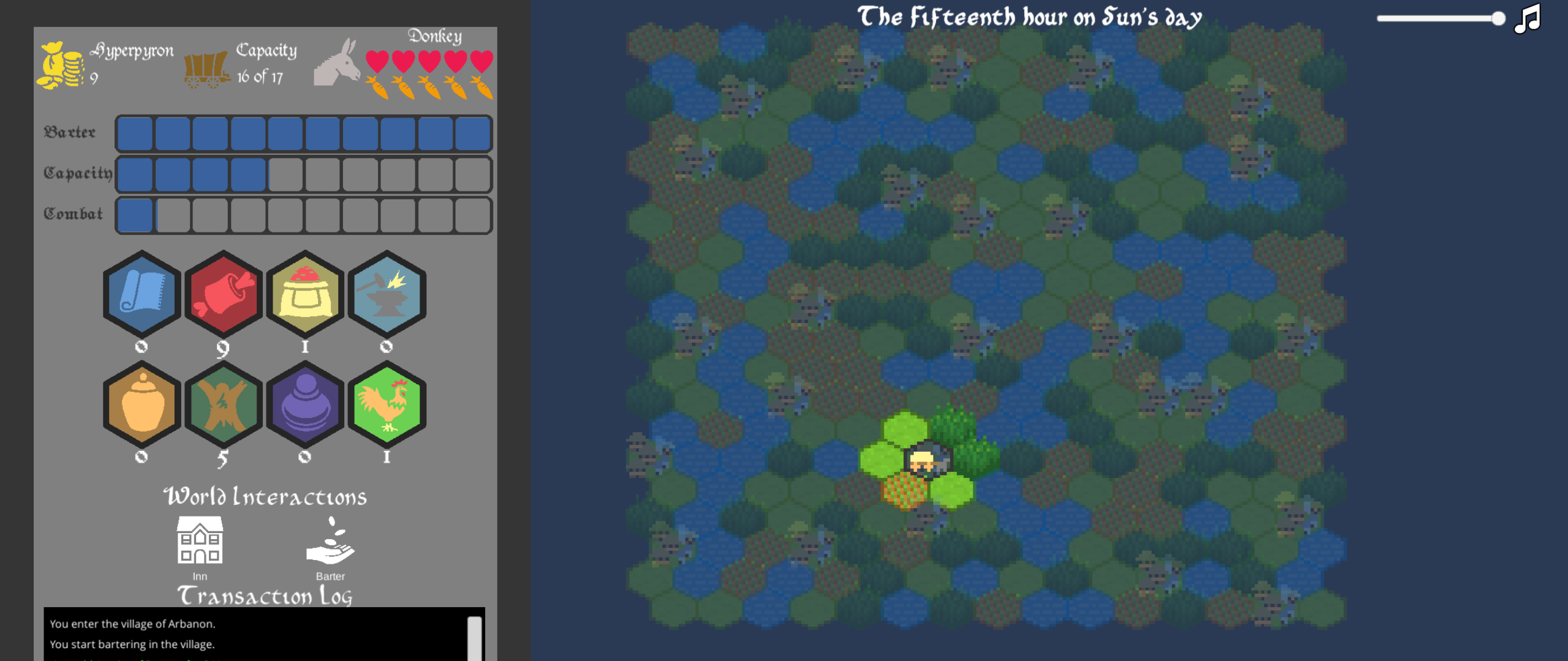
I’ve actually played it a few more times, it is quite addictive, and I feel it fit the theme of the jam very well. On my first run through I think I was a bit confused about the dearth and surplus stars. Maybe the fact they were stars threw me off, but I do know it took me a few villages to realize what all the barter UI represented - but it was fairly well explained by the tool tips and at some point it all clicked. There’s always going to be a learning curve with strategy games.
I also like the log, but my only feedback there would be to have some delay or spacing in the relating of messages. A lot can populate in the log at a given time, and having some separation between events might help. I think you are headed in the right direction with the color coding.
Overall, I really enjoy it. I’d love more tile variety, some additional obstacles to overcome, and maybe larger towns, but there is only so much one can accomplish in 72 hours, and I think you did a fantastic job. Do you plan on continuing development?
I'm happy to hear that the UI started making sense after a while. I was worried that in the absence of a tutorial it would be confusing so I added the tooltips as an intermediate step. Do you have any recommendations on what would be a good replacement for stars? Originally I had planned on doing a bar that shifted color tones, but I wasn't sure that it would be very accessible for color blind individuals.
Adding some buffer between the logs is a good idea. Under the Lamp (User), had some other feedback such separating out the inventory portion from the story elements that I may tweak as well. I'm glad to know that the color coding was helpful in keeping relevant information apparent. I tried to break it down between Informational (White), Story (Cyan), Warnings (Red), Buying (Magenta), and Selling (Green).
My hope is to continue development and do some major UI overhaul. As you know in these JAM games once you commit to a certain path it's hard to pivot design decisions even when you recognize they can be improved when you are running out of time. My hope is to have a hand crafted map with some narrative elements sprinkled around which will include new features/obstacles/towns/ports/etc. I was planning on adding "larger" towns in this iteration in the form of villages being next to each other, but they merge their resources together, but again, time was limited and the current system was functioning well enough to get the idea across.
Thanks again for the additional feedback!
Thanks for the feedback. Would you mind clarifying a few things?
Did you play the game in full-screen mode?
Regarding the numbers in the UI, were they hard to get because they were small or did you feel that the tool-tip did not offer a sufficient explanation of what they depicted? Did you eventually understand what they meant after playing a bit or were there still unknowns?
Regarding the number tracking, was the transaction log not sufficient for tracking the buy/sell price or were you wanting some type of indicator in each town UI to inform you of the potential profit/loss for your transaction? If it's the latter, were the surplus/dearth indicators not useful?
 Yes, i've tried the fullscreen mode (resolution 2560x1080), the text and tool-tips are readable.
Haven't given the Log a chance to prove itself worthy because it gets cut off(screenshot). since the text scrolls from bottom to top, the latest information is lost. in simple browser mode the Log is undreadable.
I'm here to help make this a better experience, so gonna give it a try. how to avoid a brutal cutoff like that? 1. move the log to the other right side could solve it. 2. maybe making the log go from top to bottom would be end of it. 3. alternatively shrinking some of the other elements on the left side could also work: make all the items be in one row, decrease the vertical size of the upgrades. 4. move the items acquired to a new collumn, so that stats, money, donkey meter, capacity, actions, log remain in the first one, while the second column only holds the acquired items. link for referance of the mentioned game, check how leftside has all the goods there (https://store.steampowered.com/app/271240/Offworld_Trading_Company/)
The town stock surplus/dearth is now clearer that you've mentioned it. The stars show which button is better. so the second time i've played it, i've tried to annihilate all stars on all towns. buying till no stars left to make a good buy, selling till no stars left to make it a good sell. wasnt really even looking at the numbers, just the stars. and that I guess is some overwhelmingly useful UI, which is the surplus/dearth star indication.
Now to talk about if I was using the numbers. what would be useful to see is the money spent to acquire the items, when hovering over hexes on the left hand side. in other words a reminder at what price where the items were bought. for example, at the start of the game you sell all the silk to acquire 60 gold. then buy some food for 1 gold and tools for 7+8+9+10 gold. So the hover over the hex reminder would tell you that you've spent 1 gold on the available 1 food and 36 on the tools (average 8.5 /item). once the items are all sold this reminder would show 0 because what you have is 0 items and that gives you 0 coin. 0 item = 0 gold would make afor a great logic check.
on another scenario, with the same 7,8,9,10 value tools. let's say we sell one tool for 11. how would the acquired price change? it could be 36-11 = 25 (avg 8,3/tool). Alternatively, the tooltip could say that the average of the tools is still 8.5/item, and the total gold spent on it was 25.5 coins.
4 years ago(+1)
Thank you for the additional feedback. It has been very helpful.
The problem with the resolution for widescreen monitors should be resolved now. The problem stems from having the canvas scale with the width of the monitor rather than the height. I flipped that ratio and verified it with a friend who has a widescreen monitor. The need for fullscreen mode results from my resolution choice (1920x1080) and doesn't scale well if I modify the ratio settings on the WebGL export. It's something I'll keep in mind the next time I build a game for itch.
I like some of your suggestions for reorganizing the UI elements, particularly option 4. I had bounced that idea around while working on the game, but decided I could go back to it if time permitted. On a second note, the references to Offworld's UI are helpful for further improvements on how I can layout the assets.
Again, your idea for a historical log on the town would be a nice addition, however, my hope was to keep the player engaged in the world by having them keep track through other means about where they can find some information. Personally, if I had the game keeping track of where everything was at for me, I would just mindlessly click around without paying much attention to what I'm doing. If I continue development on this project I'll perhaps add that as and additional option or throw it in to a casual difficulty level.
Thanks again for the feedback. I'll be sure to give your game a play once I get home from work.
Leave a comment
Log in with itch.io to leave a comment.