
Indie game storeFree gamesFun gamesHorror games
Game developmentAssetsComics
SalesBundles
Jobs
TagsGame Engines

How do you make a game look good?

A topic by moonshell31 created May 10, 2025 Views: 123 Replies: 4
Viewing posts 1 to 3
Submitted

What are some of the things you consider when thinking about visual design? 

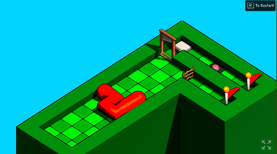
For me personally, I usually I try to imagine a few seconds of the game running in as much detail as possible- imagining the buttons you press, how the characters respond, how the camera moves, etc etc. Then I try to break that down into its individual aspects (like below).

  • perspective (top down, profile, 3rd person, 1st person, etc), whether to use a perspective/orthographic camera,
  • how simple/complex the shapes are,
  • color choice (warm/cold, vibrant/muted, dark/light)
  • lighting/no lighting
  • how stiff/fluid the movement should "feel" (this is more of a gameplay design consideration, but I tend to think about them in tandem)

 From there, I try to make a basic scene, working from the easiest to implement to hardest to implement. Usually in the middle I'll do some gameplay programming to make sure the aesthetic fits the "feeling" of the game, and to make sure the mechanics I have in mind are feasible. If not, I'll go back and reimagine the game without the scrapped mechanics

Submitted (1 edit)

But every time, it doesn't quite feel right. I never can quite get it to look and feel how I want (or even get close, for that matter). Is it a matter of experience? Or am I approaching visual design from the wrong angle?

In my last game jam, I was really happy with how it ended up looking visually. Nothing we did was technically very challenging, but the choices we made worked well. Most of that is thanks to my partner, he came up with and implemented a ton of the ideas that I didn't know how to do at the time (or even know were possible, he worked some magic on the lighting and color grading). I hope this time I can make this game look good too.


Submitted(+1)

I usually use the game to guide the visual design. I start with the worst programmer art imaginable (circles, stretched triangles, capsules at weird angles) and upgrade only once it becomes clear the existing art won't cut it. And above all, I try to make things readable: make sure the player can see and differentiate themselves, hazards, and goals/powerups as easily as possible. But if there's one thing I've learned from my artist friends, it's that the final product never looks exactly like what's in your head - part of the artistic process is learning how to incorporate quirks and limitations rather than fight them (easier said than done). The game art you show looks excellent though!

Submitted

Thank you! Readability is really important, I usually forget to consider it. I think we're running into readability problems with our current game art, so I'll have to figure out how to fix that.

Submitted

Contrasting colors/shapes can be really useful from my understanding? If you want something readable but still cohesive, I've heard that taking a bright contrasting palette and putting a hue over it is a quick "hack" to make it blend better, though I admittedly haven't tried it.