Play game
Crop Craft's itch.io pageResults
| Criteria | Rank | Score* | Raw Score |
| Best use of the theme | #12 | 2.777 | 3.000 |
| Most likely to make an impact | #14 | 2.160 | 2.333 |
| Gameplay | #16 | 2.160 | 2.333 |
| Overall | #18 | 2.160 | 2.333 |
| Audio | #18 | 1.697 | 1.833 |
| Graphics | #24 | 2.006 | 2.167 |
Ranked from 12 ratings. Score is adjusted from raw score by the median number of ratings per game in the jam.
Please let us know your team's name
Team #25
Leave a comment
Log in with itch.io to leave a comment.


Comments
We really appreciate you taking the time to leave feedback. We had a scoring system we wanted to implement but unfortunately ran out of time :(. Also, your note on the graphics/music is on the money and could use some much more TLC.
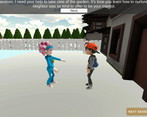
I really like the intro for how to use the game and also set the scene. The concept is a great use of the theme. I hope you find time to finish developing it!
Thank you for your feedback! It's greatly appreciated. We are happy to hear you enjoyed the intro.
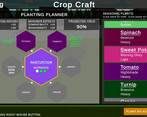
Nice work on the interface - a game like this lives and dies on UI and yours conveys a lot of info in a pretty clear way. It's a shame there's no completed gameplay loop yet as it means there's little motivation to design the perfect garden (unless I missed it, which is totally possible).
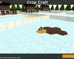
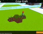
Respect for turning up the seasonal variation to 1000% so that in winter you're gardening through a blanket of snow and in summer you're gardening on the surface of the sun
Thank you so much for taking the time to leave us some feedback. You are totally right that interface is a key focal point in these types of games. Moving forward we will definitely speed more time refining it.
Hey sorry I feel really bad, there was a key typo in my comment! I meant to say "nice work" on the UI because I thought it was good! And then I basically said the opposite hahaha
Possibly proof I've been writing these comments too quickly and need to slow down...
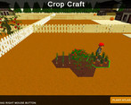
There didnt seem to be much going on here, guessing you wanted a bunch more mechanics because you made a very solid foundation in a short time. Git ambitious for 5 days :) It is a bit hard to see stuff sometimes with how bright the ground can be but otherwise i liked the plant art and the atlas and planting interface were pretty cool.
Thank you so much for your feedback! We most definitely take a pass at the Post-Processing effects to make things more visible.
This feels like a farm expansion in the Sims! It's super cute. I like how many details you added into the menu and plant atlas and how you explored the relationships between plants.
Notes from gameplay:
chill music
I like that there's story!
grandma is a fun animation, love the curlers
lol i love this neigbor's walk and vibe
oops bricked the tutorial, did a left click instead of hold, opened up a menu, can't click the close button because it's behind the tutorial text
ah menu popped up as tutorial, all good
oh wow, this is complex, lots of detail and educational!
i like the control info on the bottom bar, great detail included in polish
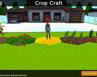
summer, can't see the tiles, everything is yellow
basil doesn't seem to plant? tried it in both spring and summer on first tile
controls feel a bit unituitive
- i want to use scrollwheel to navigate the ui but it zooms camera
- cardboard should be the top choice since it's used so much
- sideways scroll in plant atlas is hard to use
nice planting animations
is the button next to the name of the season supposed to advance seasons? It looks like a button to access a menu
fun seasonal decor
Thank you so much for taking the time to leave feedback. It truly means a lot. Everything you mentioned is a great learning lesson for us on what works/doesn't work and will definitely apply it in the future.
look the url of this post spells boobies
Show post...
im 232 days late lol