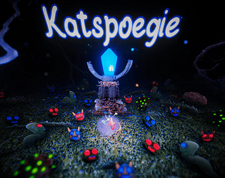
Play katspoegie
Katspoegie~ (Prototype)'s itch.io pageResults
| Criteria | Rank | Score* | Raw Score |
| Overall/Fun | #47 | 2.530 | 4.000 |
| How polished/complete is it? | #49 | 2.530 | 4.000 |
| Overall | #53 | 2.214 | 3.500 |
| Innovation/Theme (If the optional theme is used) | #72 | 1.581 | 2.500 |
Ranked from 2 ratings. Score is adjusted from raw score by the median number of ratings per game in the jam.
Leave a comment
Log in with itch.io to leave a comment.


Comments
I'm a huge fan of the presentation and the music.
Although at first they were confusing, i quickly grew fond of the mechanics and found them very fun.
Unfortunatelly the game performs poorly on my computer for some reason which makes it feel clunky. The ship would also get frequently stuck on the respawning rocks and bushes which added to the feeling of clunkiness.
But overall i really enjoyed this game!
Wow! Thanks so much for the kind words and for checking Katspoegie out, I really appreciate it!
Apologies to hear about the performance issues your'e having, I think I accidentally forgot to enable the Graphics settings for the game, I will try to get an update out later today that will re-enable it then you should be able to set the graphics a bit lower, sorry I didn't really have enough time to concentrate much on optimization.
I am planning on doing a 2nd Prototype in a month or 2's time with new game modes, I will try to check if I can make the movement and collisions a bit less clunky then.
Thanks again so much for the support and the valuable feedback, I truly appreciate it :)
Looking forward to the update.
Keep up the good work!
Cool! The game is very complete and juicy! Almost everything felt so good in this game!
Because I see a lot of effort, I want to share some critism.
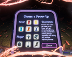
I didn't understand the point of Blue/Red bullets. I know there is an alarm sound that remembers to swap, but I couldn't see the difference between using one or the other. Also, the upgrades menu became a bit broken, so I couldn't click on other tower upgrades but the blue one (and I only had two). Also, it is hard to see the enemies that come from the background.
I see a lot of effort and love behind this game. If it is a prototype of somethinh bigger, go for it!
Wow! Thanks so much for the kind words and giving Katspoegie a try. Also thank you so much for the feedback, I'm gonna try make the uses for the blue and red a bit more apparent as they are used to switch enemy colours in order to allow the tower to recognize and attack them. I will take a look at the Power-Ups menu as well as I know the buttons are a bit iffy on it, as a tip the whitened out buttons are unselectable, there are 5 power-ups for each the tower and the player but only 3 slots each so every time you select a new power-up (not an upgrade) a random other power up gets disabled, this is to encourage replays and combos with different power ups. I will def check if I can somehow make the background a bit les obtrusive without breaking the atmosphere.
Thanks again so much for the amazing feedback and trying out the game, I really appreciate it. I'm gonna take on a new concept for my next prototype, but I will prob come back to this one in about a month or 2.