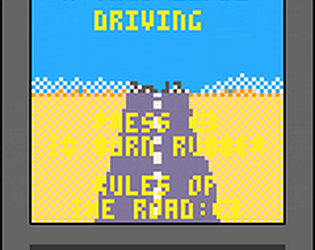
Play game
A-Taco-Lypse Driving's itch.io pageResults
| Criteria | Rank | Score* | Raw Score |
| Audio | #74 | 3.250 | 3.250 |
| Authenticity (Use of 64x64 limit) | #84 | 4.333 | 4.333 |
| Overall | #90 | 3.479 | 3.479 |
| Enjoyment | #102 | 3.000 | 3.000 |
| Graphics | #103 | 3.333 | 3.333 |
Ranked from 12 ratings. Score is adjusted from raw score by the median number of ratings per game in the jam.
Leave a comment
Log in with itch.io to leave a comment.


Comments
Neat idea! I included it in my LowRezJam compilation, if you’d like to take a look :)
Hey, thanks for playing! This was my first completed game so it's pretty rough around the edges. Hopefully my next game will be a little more intuitive!
I'm happy to see somebody else did a driving game (completely different from mine).
I got confused by the "recipes" in the instructions, so I just drove around hitting stuff.
Honestly not bad for your first game. Controls are smooth, it makes the game enjoyable. I'm just not sure what items I was supposed to hit (beside avoiding the other truck :p ).
Thanks for playing! The biggest hurdles for me were to focus on the essential mechanics and transfer those ideas from my head into practice. As a novice programmer those issues were also compounded with me stumbling around in the dark when trying to code (at least for the beginning!) There are definitely things that I know need work but this was a good project for me to cut my teeth on. Onto the next game!
As for the objective, I'd originally had a matching mechanic but that felt a little frustratingly constrained in a 64x64 canvas when RNG would give a string of one type of food. To try and work around that I tweaked the matching mechanics a little so that instead, the customers on the right will display the food they DON'T want,leaving you open with two other options. I still stand by that mechanic but I think the thing I'd definitely change is how those rules are communicated. I wanted to focus on an intuitive type of learning through gameplay and visuals but that fell short in a few places. If we're still allowed to adjust I'm probably going to put a giant red X on customer food so it's a liiiiitle more obvious.
That still sound complicated, especially when you have little to no time to explain the mechanics to the player. I would have stick to the matching mechanic. (but that's just my beginner advice ofc :p)
psychedelic graphics and concept. well done.
Thanks so much for playing! I had a great graphic designer and musician to work with, so I'm glad I was able to tie all of our efforts together into a (hopefully) cohesive product.