Play game
Apocalyptic Allies's itch.io pageResults
| Criteria | Rank | Score* | Raw Score |
| Originality | #9 | 2.840 | 3.667 |
| Fun | #11 | 2.066 | 2.667 |
| Use Of Theme | #11 | 2.582 | 3.333 |
| Community Spirit | #13 | 2.324 | 3.000 |
Ranked from 3 ratings. Score is adjusted from raw score by the median number of ratings per game in the jam.
Team or Solo?
I was the programmer while Zecerman was the artist it was a two person duo.
Credit:
I used a font vermin vibes 1989 and edited some free sounds that didn't need to be credited from freesounds.org
How/where did you put the theme in your game ? (in short)
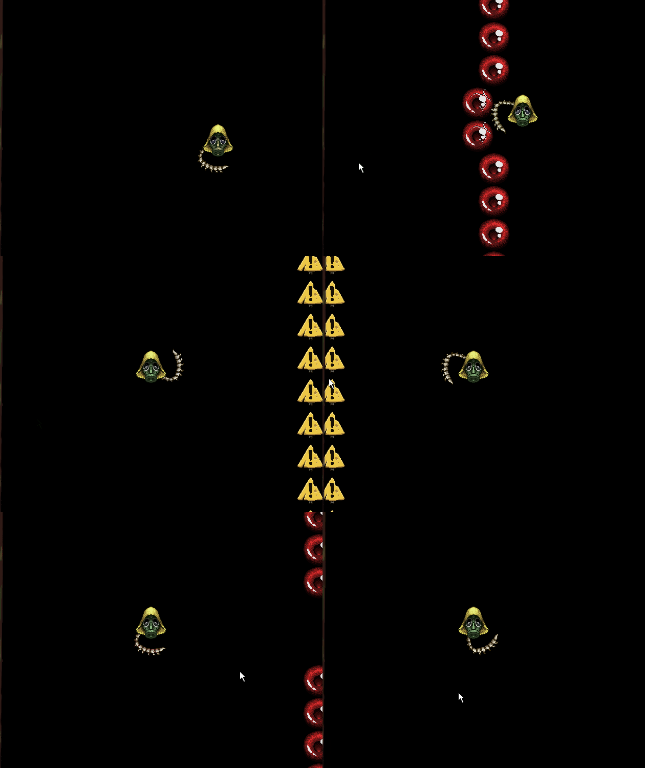
I had the main tool/ability be a foreign entity, the shield you use is a second living spine. so when the player moves the mouse it would be the entity moving around on it's own.
Did you (you or your team) do the graphisms yourself?
Yes all the ideas were thought of through brain storming, we choose an second spine instead of a extend arm because we thought it was a more unique and expressed the theme better. would be an example of our train of thought.
Did you (you or your team) do the musics and sounds yourself?
yeah we built them using beepbox.
Leave a comment
Log in with itch.io to leave a comment.


Comments
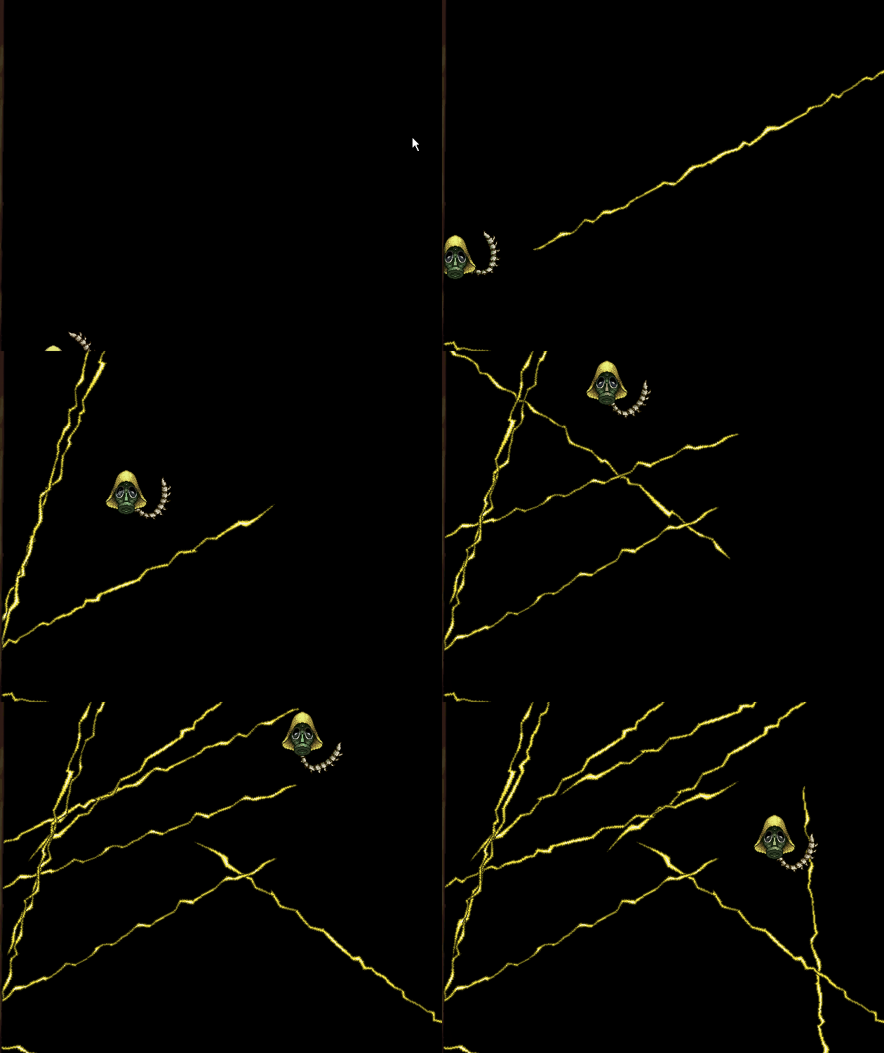
Really liked the story and build up to the game, felt like a classic arcade game and would like to see more, maybe different levels of music and sfx with the lighting and other enemies. I really like the pass of the over all game and how you could continue even if you dies. If you added a score to be able to skip or something to push players to achieve a highscore would be added fun. Keep up the hard work!!!
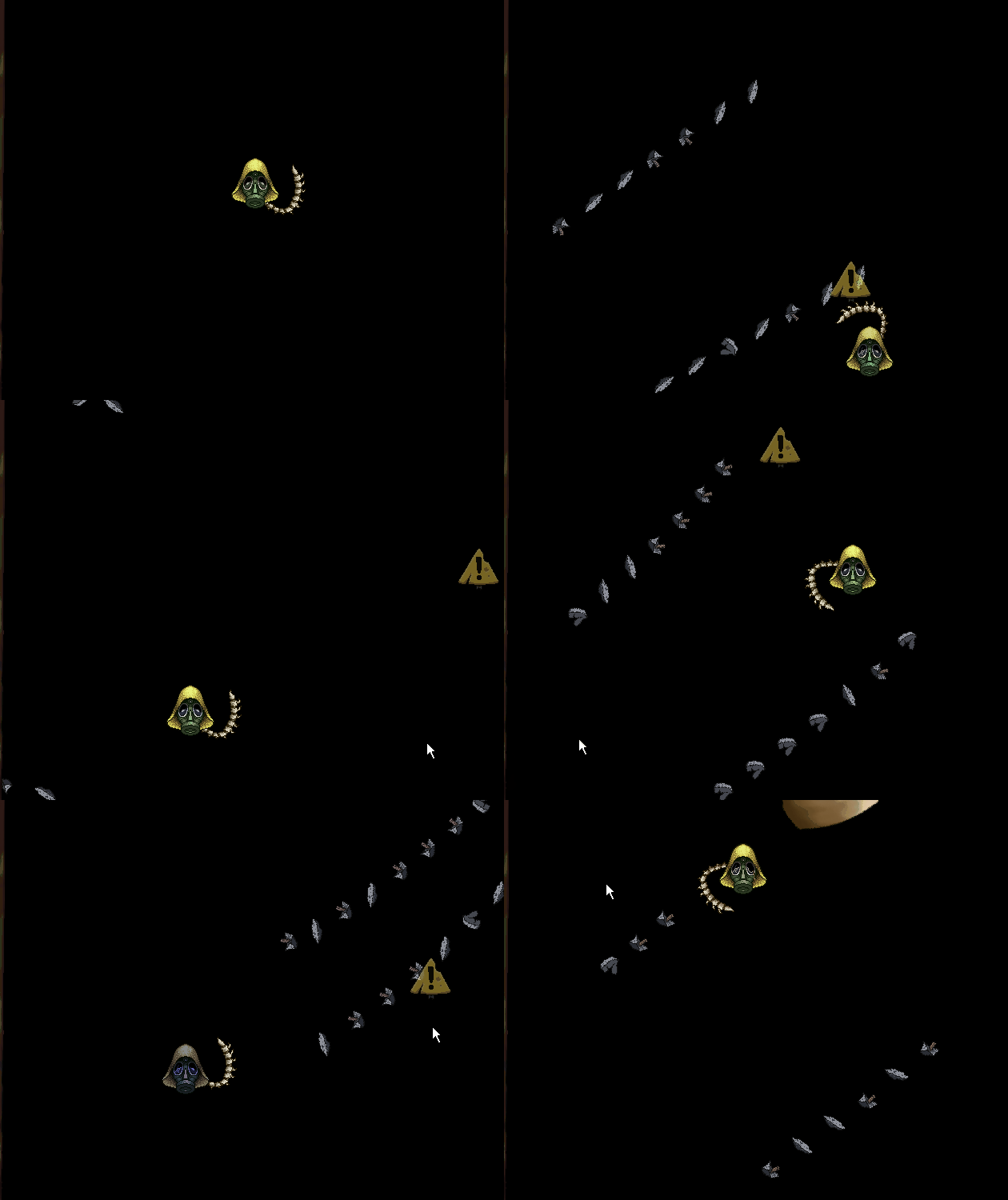
A really interesting experience, seeing screenshots we first think that there are not many graphics in the game, but it's just false !
1. there are many full-size drawings telling the story and decorating the screen !
2. This kind of game actually needs to have its playfield simple enough so the player is not drowned by too much graphics ! I particularly liked the fact that the life bar on the left is duplicated on the player's sprite through the mask breaking.
Overall it's a difficult game but that's what it was meant to be. The concept is well put together and shows a nice little "bullet hell" feel.
I like the concept but I suggest you tweak how the user can interact with the user interface since it is very annoying to reach the z button while my hands are positioned in the arrow keys and the mouse. I also had difficulty starting the game until I read your itch page. I suggest using mouse input to the ui instead.