

Play prototype
SUB MORTIS's itch.io pageResults
| Criteria | Rank | Score* | Raw Score |
| Visuals(Graphics) | #16 | 2.021 | 3.500 |
| User Interface (UI/UX) | #16 | 2.021 | 3.500 |
| Audio | #19 | 1.155 | 2.000 |
| Overall | #19 | 2.021 | 3.500 |
| Fun | #19 | 2.021 | 3.500 |
| Overall | #19 | 1.848 | 3.200 |
Ranked from 2 ratings. Score is adjusted from raw score by the median number of ratings per game in the jam.
DevLog Link
https://enygmatic.itch.io/sub-mortis/devlog/236774/improve-my-game-jam-14
Developer Feedback Questions
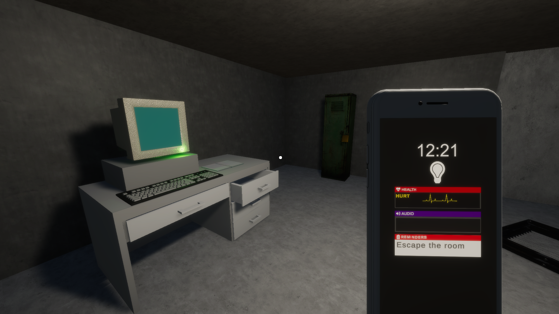
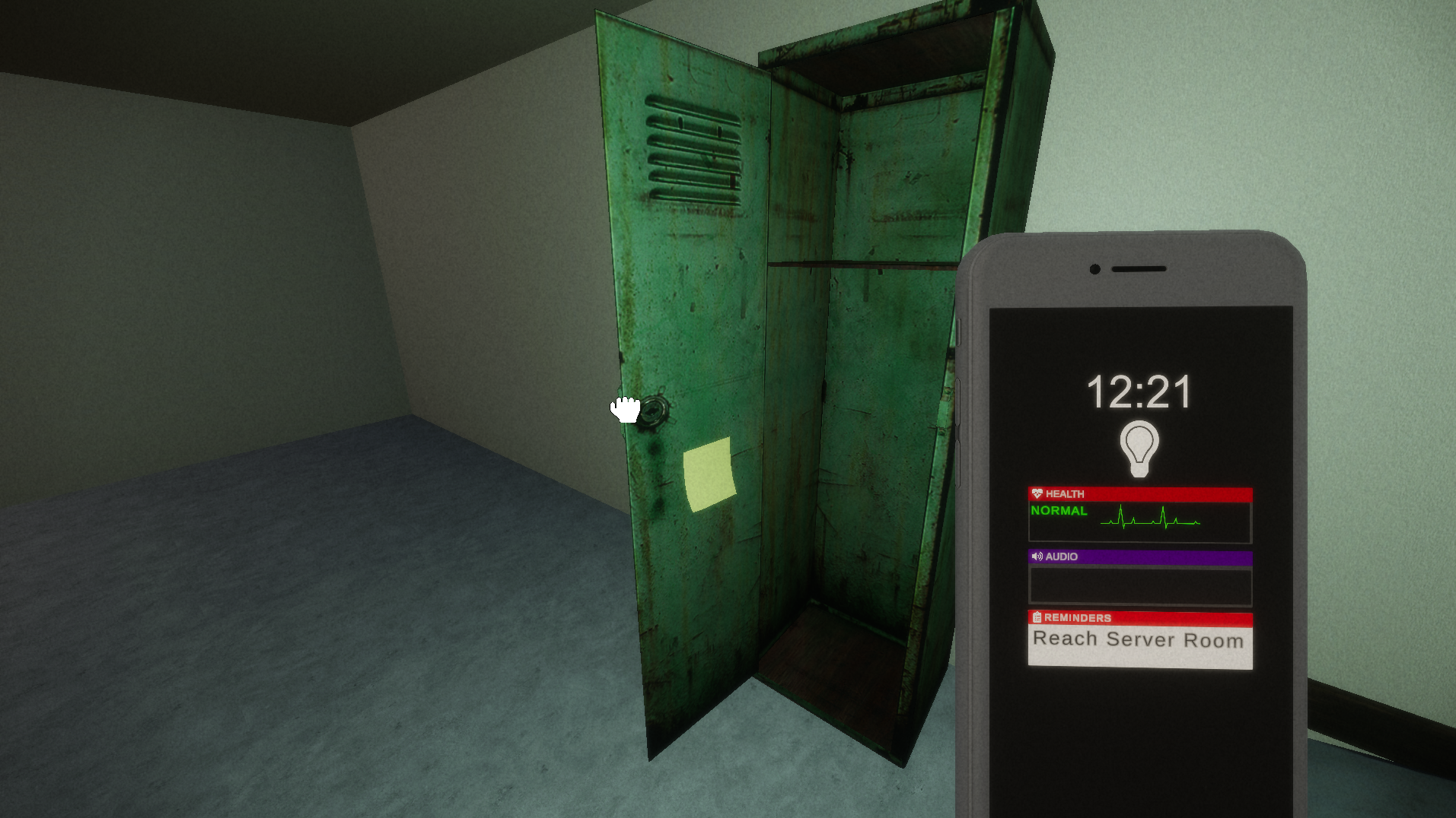
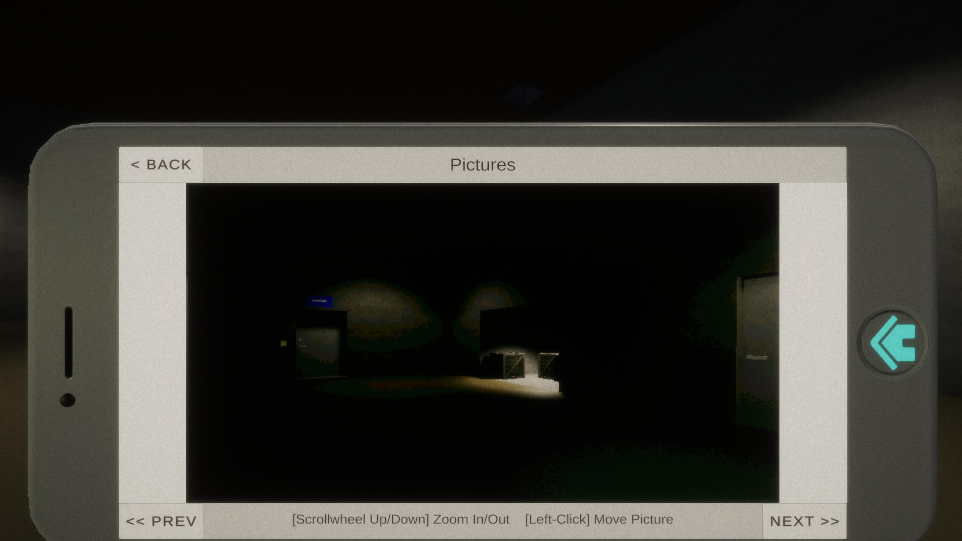
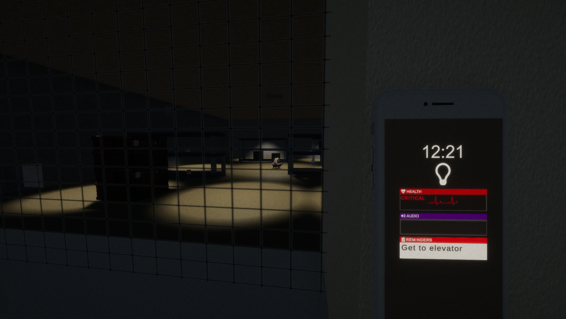
Any feedback or suggestions on improving the physics interaction, hints, and smartphone UI/usage would be great. Other suggestions and bug reports would also be nice.
Leave a comment
Log in with itch.io to leave a comment.
Comments
Very good prototype. I think if you keep developing this one, it will be really good. I feel the controls a little bit slugish and agree with comment below regarding immersion (this kind of game needs to exclude any hints that take away from the experience), and audio can be improved, but that's it. Congrats!
Hey thanks for trying it out, glad you liked it!
With the controls I assume you mean moving objects with the mouse? The movement speed definitely needs to be upped, still trying to find a balance between fast enough to be fairly responsive, but slow enough so that objects don't just jump 90 degrees. If its controls other than the interaction I'd be interested to hear any thoughts on specific areas.
Yeah the environmental hint is overkill, if nothing else I learned to NOT do that in further updates.
Is the issue with the audio that the sounds are kinda stock and bland? Because if so I think you're right but I simply haven't had time to hunt down better ones. If there was any other issues like sounds playing too loudly or glitching out then I'd appreciate any further feedback.
Thanks again for playing and for the feedback!
Dang. This was pretty cool!
I'd recommend changing your emphasis in a few places:
1) The hints you give in the menus as to controlling the different applications are a bit overdone and therefore overwhelming. Don't worry - it's quite intuitive, so you can probably strip around 80% of the text. Don't make the same mistake I often did and cradle the work you've already done. Now that you've done that work, you can assess what you should keep. Maybe just keep basic functionality descriptions of each application.
2) The controls are also a bit overwhelming in their descriptions. Find a way to reduce that information through a visual of the buttons, or grouping together similar buttons into a single pictograph to reduce visual load on the player; you don't want them leaving your cool experience just because of some UI!
3) Kill the environmental hints. Things like pointing out the computer code within the light box are a bit much and certainly the most immersion- and challenge-breaking of these three text-overload points. Something like the notebook on the table was nice, as it seemed more naturally a part of the environment.
I'm not sure if the game box was a red herring, an Easter egg, or both, but it was fun to manipulate. I really enjoyed the physicality of the drawers and levers, as well as the sound design and atmosphere combining to form a real sense of interactivity.
Keep going!
Hey thanks for trying it out, glad you enjoyed it!
Yeah the hints definitely need re-working, the reason they are so blunt and numerous is that when I did two rounds of playtesting before people got stuck on what I thought were pretty trivial things. Basically I've been attempting to idiot-proof on a tight deadline. In the longer demo I have planned, these hints would be spread out a lot more and the player would have more space to experiment.
But reducing the text load into visuals is a nice idea, and one I hope to implement. The inventory screen is an especially bad offender in the text-overload in my opinion, but I'd be happy to hear of any other specific examples.
By environmental hints do you mean the ability to examine objects or just the blatant hinting like sticky note on the wall? Stuff like the note I don't intend to keep, but was put in to make sure people used the phone to scan the QR code. It breaks the challenge entirely, but it does make it a certainty that people use the scanning mechanic and can provide some feedback on it.
The game box is an easter egg, its for the first game I ever uploaded to itch for the "So Bad It's Good" game jam.
Happy to hear you liked the interactivity and atmosphere, I'm trying to get a real immersive feel with this project, so hopefully that'll be achieved once I get the UI clutter toned down. This is also the first time anybody tried the new physics interaction, so it's nice to know the last month wasn't wasted lol.
And I will keep going with this because if I don't, then I fail my university course and can't graduate this year lmao.
The primary environmental hint I was referring to was the blatant stuff, yeah. Examining stuff in general is the whole fun, and one I can see you working hard to deliver on. It's good stuff. Know that the stress of school isn't the only thing that can push you here. I like what you're doin' ;)