Play game
LIGHT OFF's itch.io pageResults
| Criteria | Rank | Score* | Raw Score |
| Gameplay/Fun | #43 | 2.111 | 2.111 |
| ZERO UI | #44 | 2.500 | 2.500 |
| Theme | #48 | 2.389 | 2.389 |
| Overall | #51 | 2.222 | 2.222 |
| Visuals/Audio | #59 | 1.889 | 1.889 |
Ranked from 18 ratings. Score is adjusted from raw score by the median number of ratings per game in the jam.
Game Engine / Tools
Godot
How does your game fit the theme?
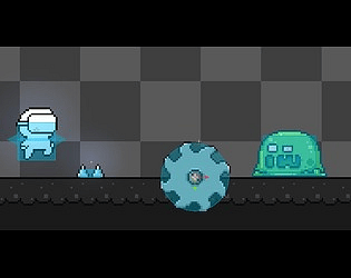
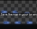
Light Off fits the theme of darkness and challenge by requiring players to navigate through a darkened map after memorizing it. The lights turn off, leaving players to rely on their memory and precision to reach the end without dying, emphasizing the theme of overcoming obstacles in the dark.
Self-made stuff
Assets (e.g. free or owned)
Leave a comment
Log in with itch.io to leave a comment.


Comments
Nice Concept. Looks like we had the same idea xD
my game 2d and platformer puzlle your 3d puzzle i lke your game
Nice concept for this platform game.
Was fun to try to memorize the level and getting pass all obstacles without dying.
Maybe just some extra time at the start would be nice.
Hitboxes were maybe a bit harsh.
The background track had something. Liked it.
Cute pixel art style.
Overall a well done jam entry!
thanks for this beautiful game jam
Love the concept of the game.
thanks
I didn't really understand the implementation of the theme, like trying to remember the arrangement in the room and then the light goes out, but I still see all the traps and it's very easy to pass /: But still a cool game
thanks
Great Mechanics & Theme implementation, But need To Work On Those Collisions Sometimes They Trigger Without Touching Them
thanks
nice game but making your own assets represents creativity so make your own btw good job
thank you farek
Fun platformer! Maybe we could have some more memorisation time, but some harder stuff to remember like obstacles or ennemies!
thank you i will add modes easy medium hard
Sick!!
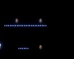
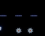
great mechanics and idea! if I would suggest something, it would be to utilize your core idea more, for instance you can see that level 1 has all spikes are visible and the background just turned black, so there is no “memorization of the level” and the same goes of all of them except the ones with holes.
But overall, great idea…. Keep up the good work!
Thank you so much for your feedback! I'm glad you enjoyed the mechanics and the core idea of the game. I appreciate your suggestion about utilizing the core idea more effectively. I'll definitely consider making the spikes less visible and working on the background to enhance the "memorization of the level" aspect. Your input is valuable and will help improve the game. Thanks again for your support, and I'll keep working hard to make the game even better!
i like the game, but i think the collision te pike should is a bit small
thanks
Pretty cool art
thank you
my good game