Play game
Mega Monsters Giga Strike's itch.io pageResults
| Criteria | Rank | Score* | Raw Score |
| AUDIO | Did the game have great music or sound design | #2 | 4.500 | 4.500 |
| FUN | Was the game satisfying to play or did it bring you joy | #3 | 4.250 | 4.250 |
| VISUAL | Did the game have nice graphics or art direction | #5 | 4.500 | 4.500 |
| Overall | #6 | 4.100 | 4.100 |
| IDEA | Was this game super interesting or innovative | #15 | 3.750 | 3.750 |
| MOOD | Did the game have atmosphere or make you feel something | #18 | 3.500 | 3.500 |
Ranked from 4 ratings. Score is adjusted from raw score by the median number of ratings per game in the jam.
Let people know how long you've been working on the game
A quick game I made this month!
Leave a comment
Log in with itch.io to leave a comment.


Comments
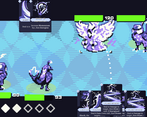
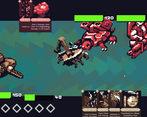
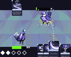
I really like the energy of this one, I could tell you were going for hype and it definitely lived up to that expectation. There is a bit of keyword overload (and some werent displaying tooltips too), and if both of your monsters were the same type it was hard to tell who was going to perform the action, but I like the ability to pick up new monsters as you defeat them and the overall variety and designs. That rusty whale carried me to the end :D The risk vs reward felt more fair than the explosion cards lol. The resolution was a bit large, my cards were partially cut off on the bottom of the screen but not too much that I couldnt read them if I hovered.
I got stuck in the first turn of the second battle not being able to play my cards or end the turn.
I wish the buttons had some change when you hovered over them for me to tell if i was going to hit them or not.
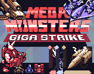
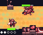
I like the pixel art, and the old-school nature of it. The card UI almost felt too smooth compared to the rest.
Launching into the battle without any instructions or tutorials was a little tough, so I had to go looking for the text document.
Biggest thing for me is that the window was not re-sizable, and I am running on 1920x1080 monitor, which seems like the right size, except, I couldn't maximize it either, and the window bar made the bottom of the game get cut-off. so maybe I got stuck due to that? I couldn't really read the card text easily, but the tool tips helped a lot.
I absolutely loved it! Starting with the trailer ("I secretly resent my friends!'' lol), going to the beautiful art, perfect music, and al the way through to the inventive gameplay, it was an all-around professional experience.